← Back to Work
November 2021 - October 2022 · Clearisk

CX Dashboard

Designing a role-based custom dashboard for a B2B fintech platform—creating personalized experiences for six different user types

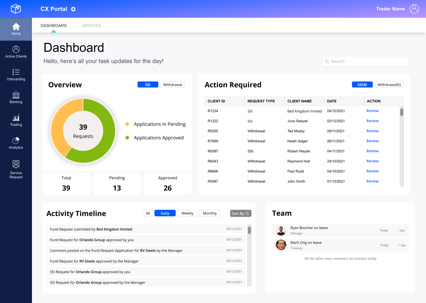
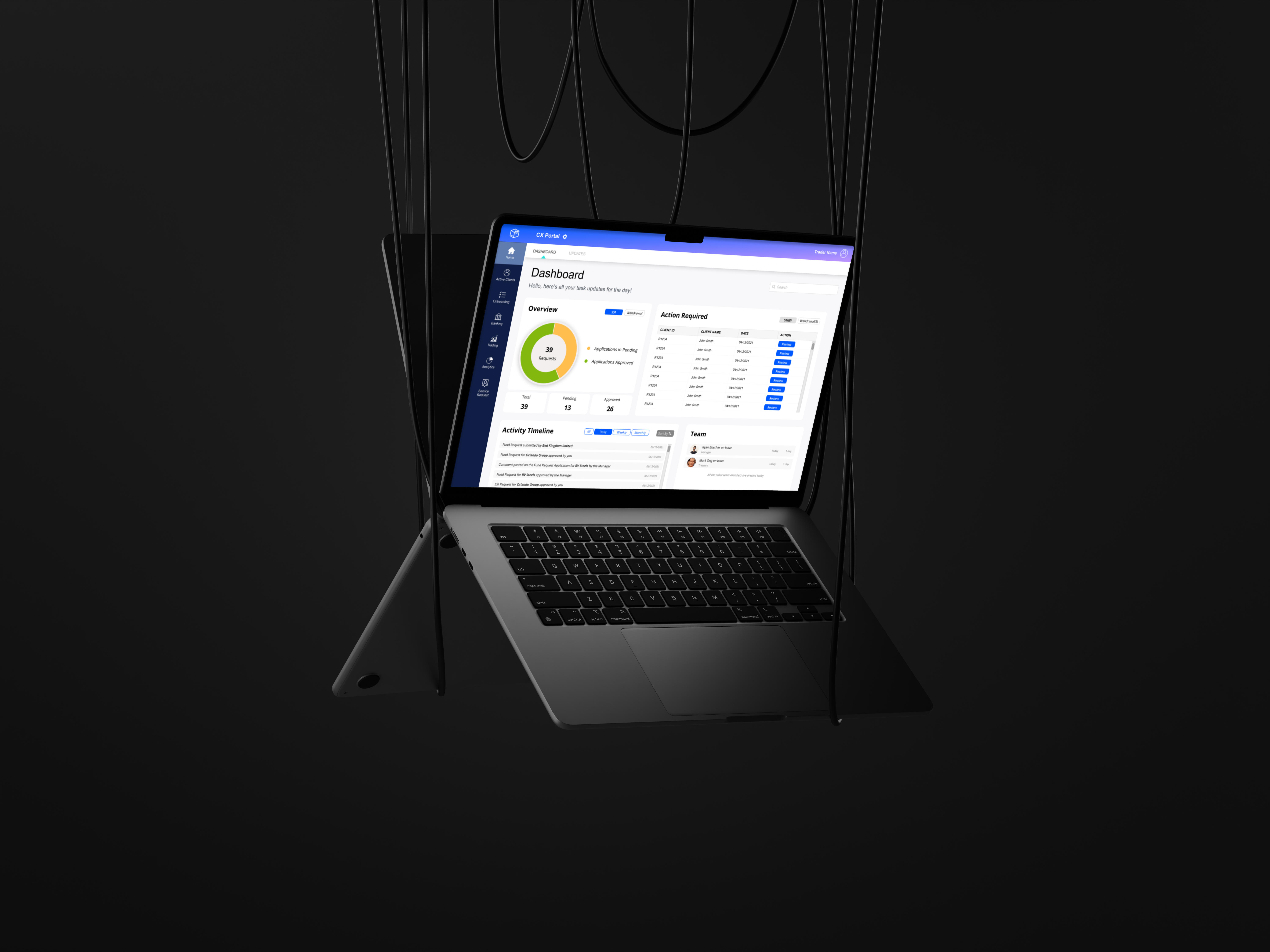
CX Dashboard overview

Context

Clearisk is a derivative trading platform offering comprehensive trade processing and client management solutions. Founded by seasoned F&O professionals with over 25 years of experience, Clearisk provides features including data input, setup & processing, reporting & analytics, reconciliation, client management, and integrations—essentially a "broker in a box."

Role
UX Designer (solo)
Timeline
11 months
Platform
B2B Web Application
User Roles
6 different stakeholder types
My Role

I joined Clearisk as a UX/UI designer in November 2021 when their applications (CX Portal and Client Portal) were in early stages. While a basic design system existed, most features were still in development. The dashboard hadn't been created yet.

After having team members and potential users from partner companies try different features, we quickly realized the need and importance of a centralized dashboard.

As the solo designer, I was responsible for:

Identifying needs and gathering requirements
Conducting user interviews
Creating user flows and information architecture
Designing for six different user roles

Other Features I Worked On

Before focusing on the dashboard, I designed several core features for the Clearisk platform. These experiences helped me understand the product ecosystem and user workflows deeply, which became invaluable context for the dashboard design.

01

Onboarding

Streamlined the account setup flow - Client + CX

02

Subscriptions

Subscription management system

03

Documents & Agreements

Digital contract management & workflows

04

Client Portal

Self-service portal for individual clients and client companies to manage their accounts

05

Roles & Permissions

Admin portal for access control and permission management feature

Dashboard - Design Process

My approach to designing the dashboard followed a user-centered methodology, ensuring each decision was backed by research and validated with real users.

01

Discover

Stakeholder interviews Product understanding Competitor research Domain learning
02

Research

User interviews (5 participants) Role mapping Workflow analysis Pain point identification
03

Synthesize

Persona creation Empathy mapping Information architecture User needs prioritization
04

Design

Wireframing Layout design (Z-pattern) Role-based customization Visual design
05

Validate

Prototype testing Feedback collection Iteration Final refinement

The Problem

Users were relying heavily on external tools like email and Slack to manage their work. There was no centralized place to get an overview of tasks, priorities, or pending work.

01

Low Application Engagement

Heavy reliance on email, Slack, and other platforms instead of the main application

02

No Overview or Prioritization

Employees couldn't plan their day or prioritize tasks at the beginning of each workday

03

Information Overload Risk

Different roles needed customized data without being overwhelmed by irrelevant information

04

Inefficient Navigation

No quick access to areas requiring attention—users had to navigate through multiple menus

My Approach

I started by deeply understanding the product, the different user roles, and their workflows.

01

Product Understanding

Asked the internal team about different user groups, their connectivity/flow, and intersection points. Researched the domain and competitors online

02

User Research

Identified six major stakeholder roles and mapped their responsibilities, permissions, and workflows

03

User Interviews

Conducted semi-structured interviews with one user from each major role (5 participants, 20 mins each, 10 open-ended questions)

04

Analysis & Synthesis

Created personas, empathy maps, and information architecture to understand user needs and pain points

05

Design & Iteration

Designed role-specific dashboards and the current workflow connectivity using iterations based on feedback

Understanding the Users

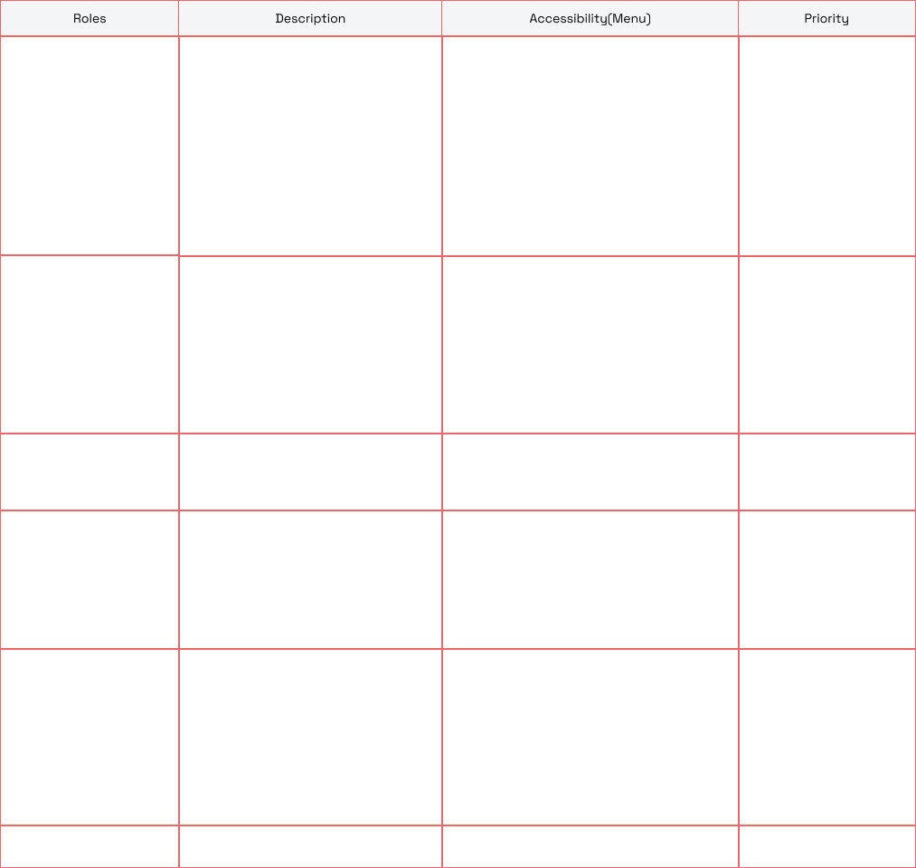
The major stakeholders fall under six categories, each with distinct roles and permissions:

01
Manager
02
System Admin
03
Treasury
04
Compliance
05
Partner Admin
06
TPRS Admin

Interview Insights

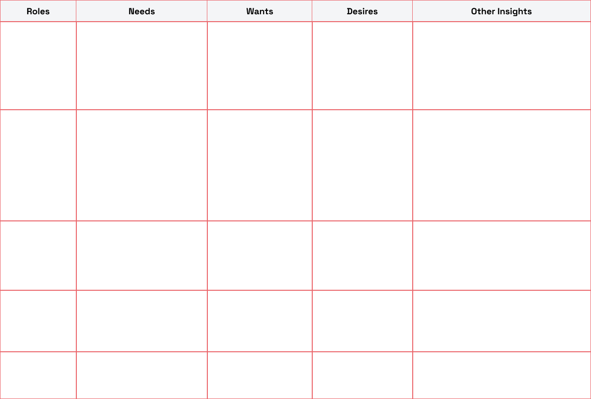
Responses from different roles revealed common patterns and role-specific needs:

Interview insights table

Persona

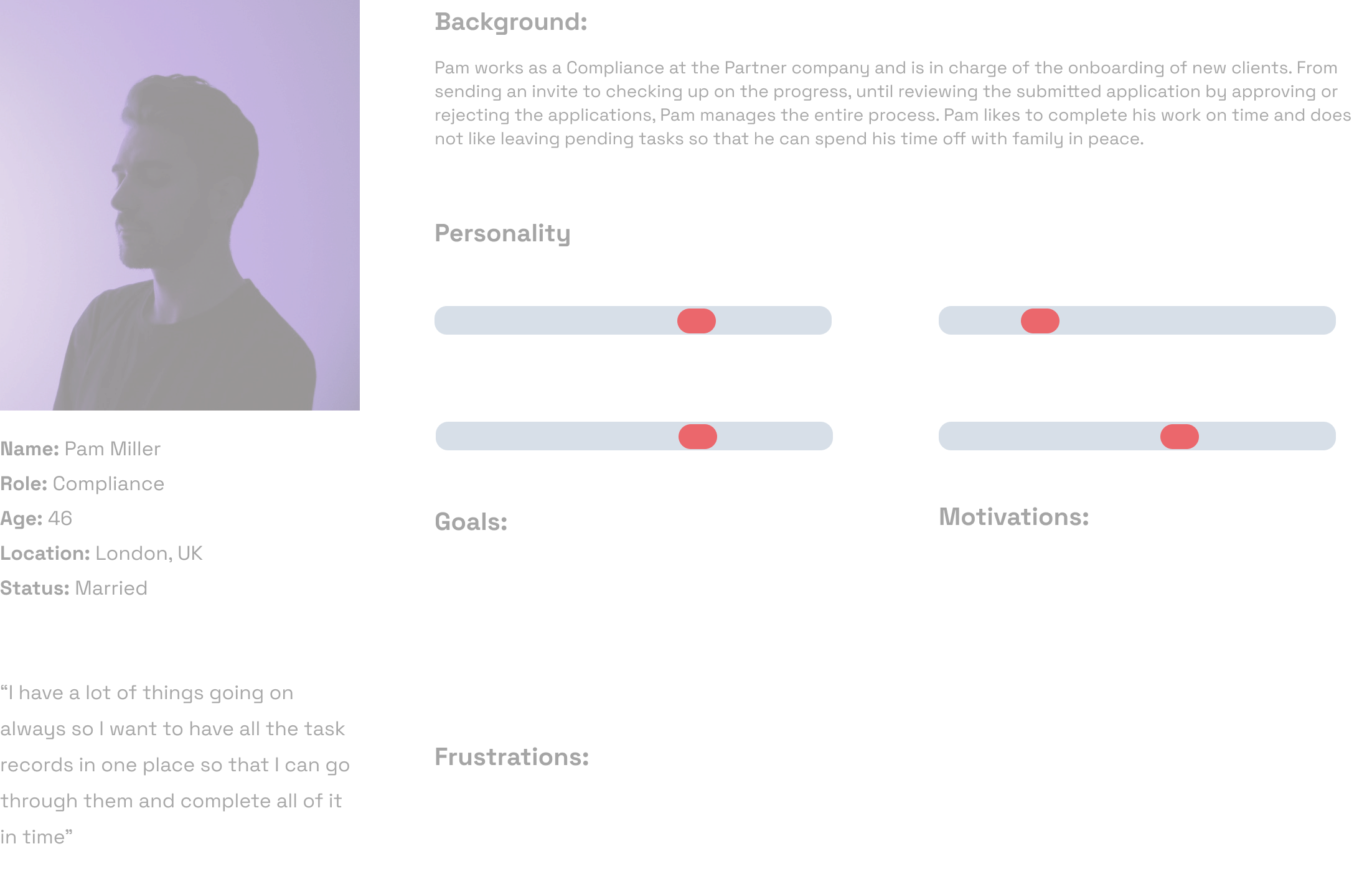
I created personas based on the interview of the different roles with their key characteristics, goals, frustrations and motivations to understand the users and their feelings towards the feature.

User personas

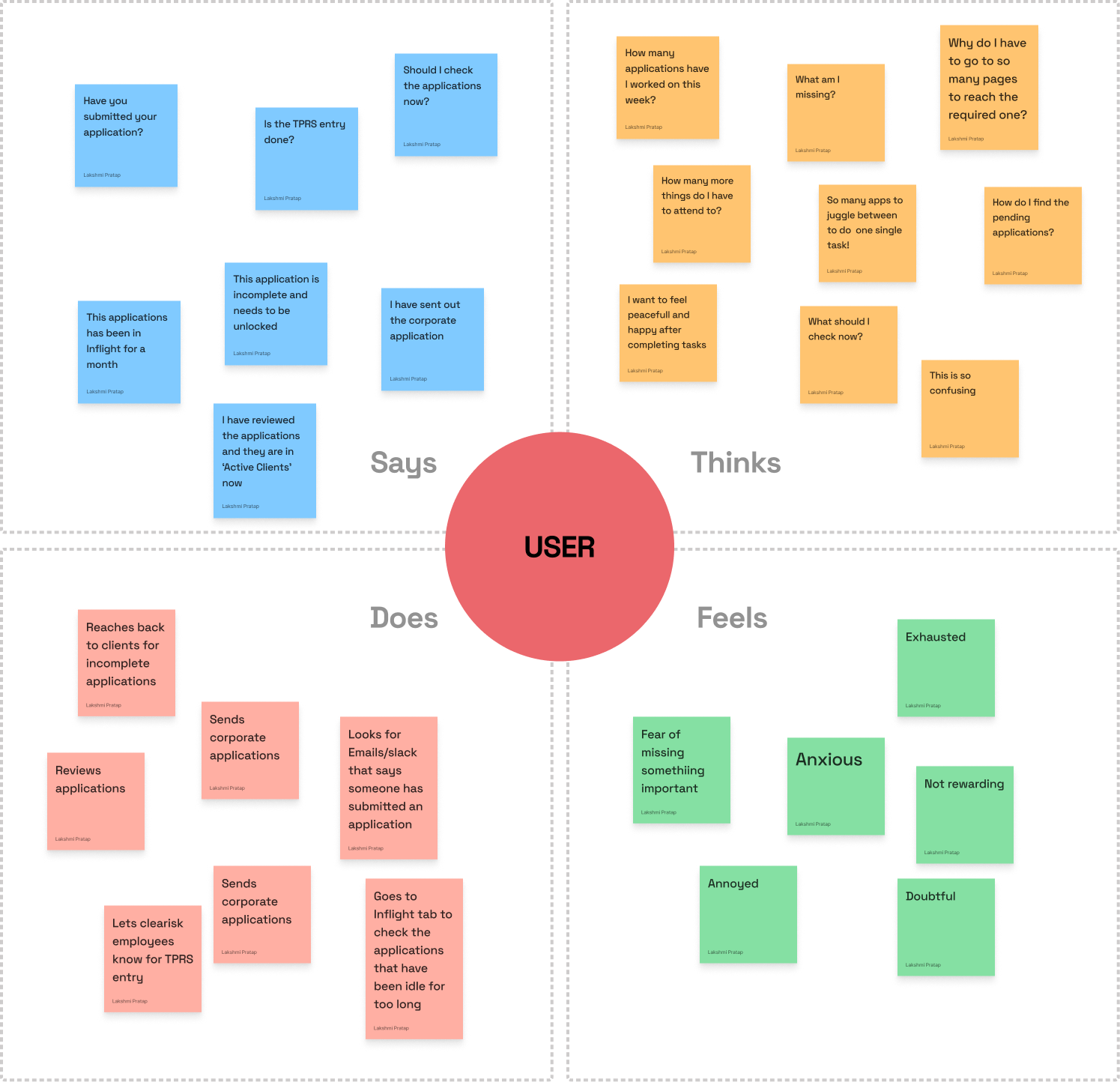
Empathy Mapping

Empathy maps

Information Architecture

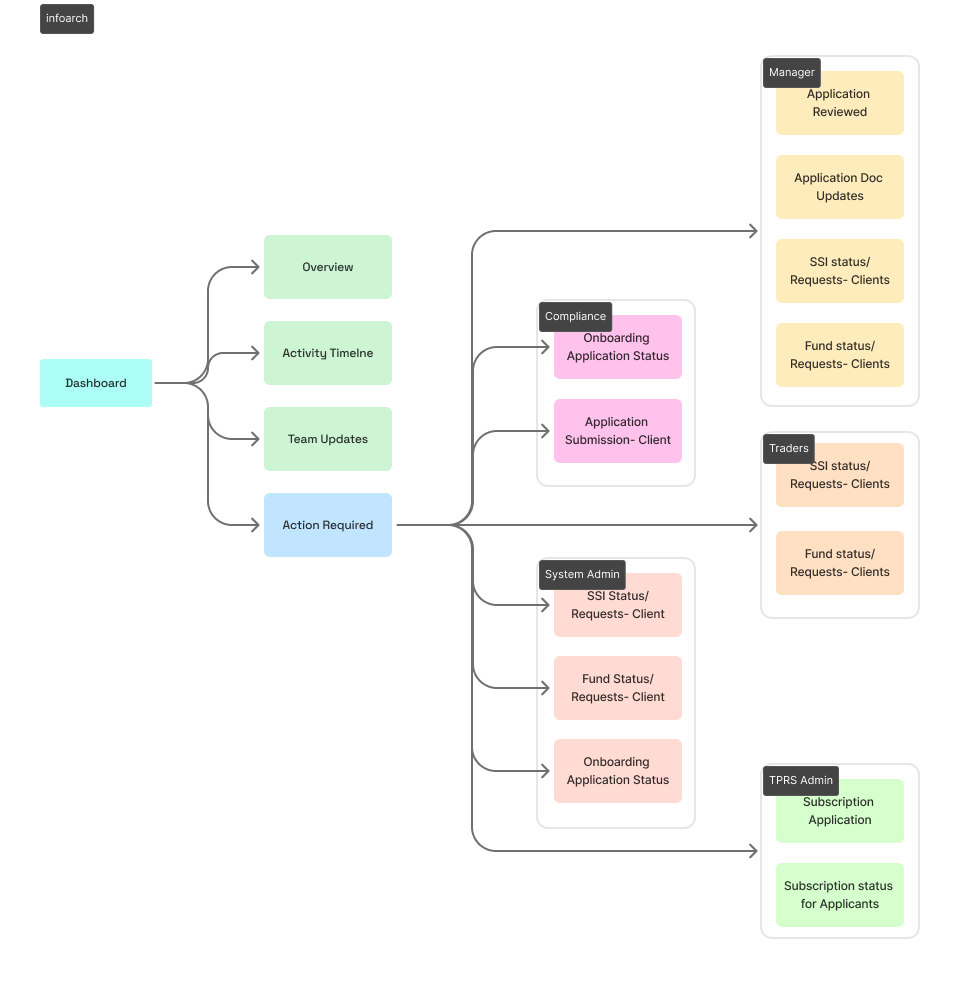
I created a combined IA for all the roles to understand the different sections required and what sections are common and what needs to be customised. Also, to know what the customisations should be.

Information architecture

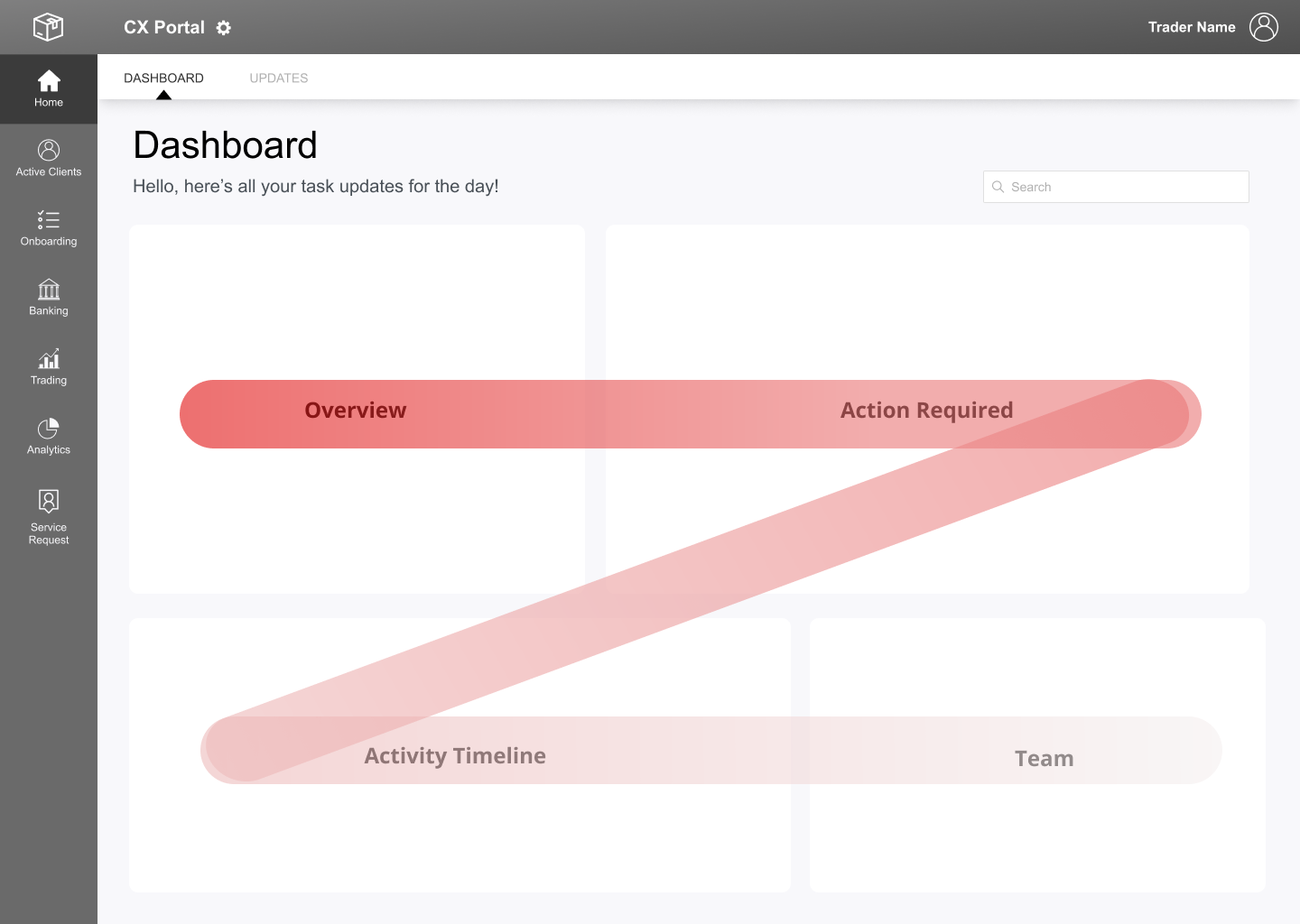
Zoning/Placement of Sections – Z-Pattern

The Z-pattern is the visual route of a human eye when viewing content on a page. People scan from the top left to the top right, forming an imaginary horizontal line. Next, down and to the left side of the visible page, in an imaginary diagonal line and then to the right.

Top Left: Overview
Top Right: Applications requiring action
Bottom Left: Activity timeline
Bottom Right: Team attendance
Z-pattern layout

Final Design

The final dashboard screens after considering all points from UX research and user requirements. Each role gets a customized view showing only relevant information and quick access to their most important tasks.

Final dashboard screens

Key Learnings

Role-based design is complex: Designing for six different user types required careful balance between consistency and customization.

User interviews are invaluable: Direct conversations with users from each role revealed needs that weren't obvious from stakeholder requirements alone.

Domain knowledge matters: Understanding fintech and trading workflows was essential to designing an effective dashboard.

Information hierarchy is critical: Users needed to see the most important information first without being overwhelmed by everything else.