Wireframes & final UI
Wireframes & final UI
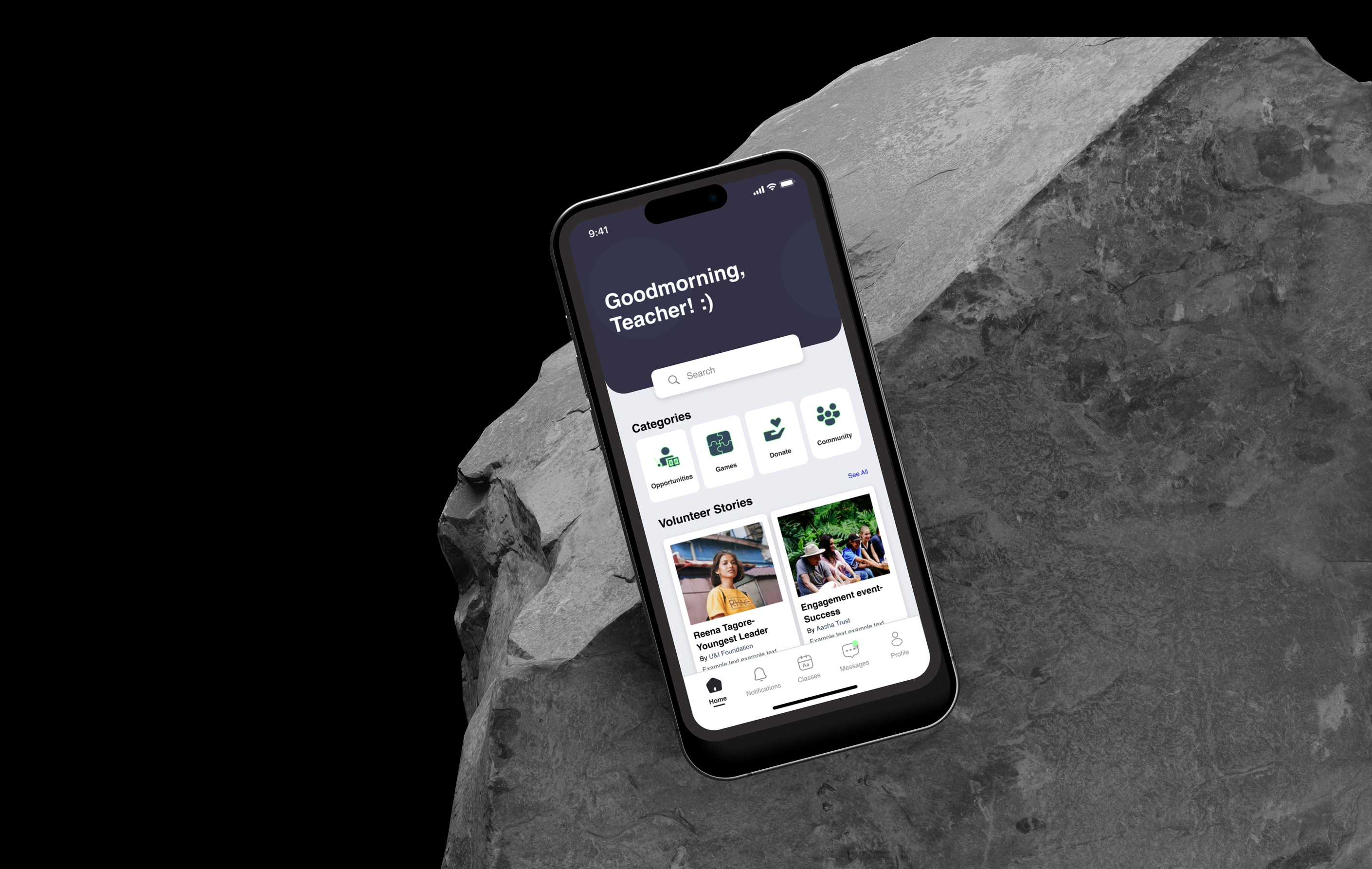
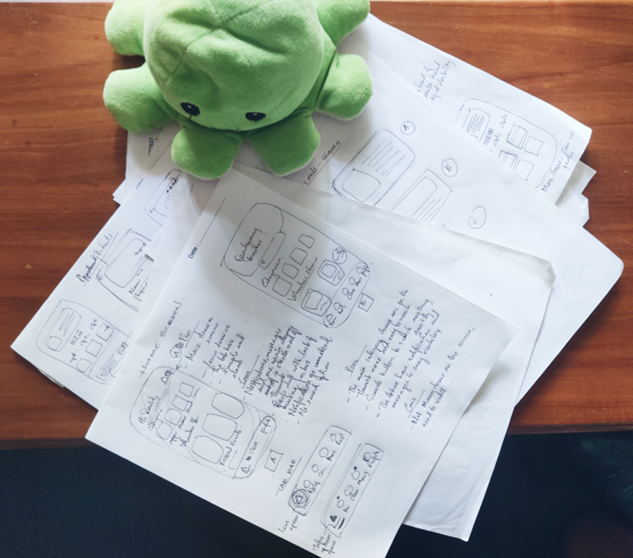
I produced hand-sketched wireframes and iterated multiple times to determine content hierarchy, card layout types, and a thumb-friendly tab bar. The final interface uses clear card patterns for opportunities, an accessible tab bar (3–5 primary items), and an onboarding flow that reduces friction.
Design decisions
- Content priority & placement: high-priority content is placed for quick scanning.
- Thumb zone: main CTAs and navigation are within easy reach on mobile.
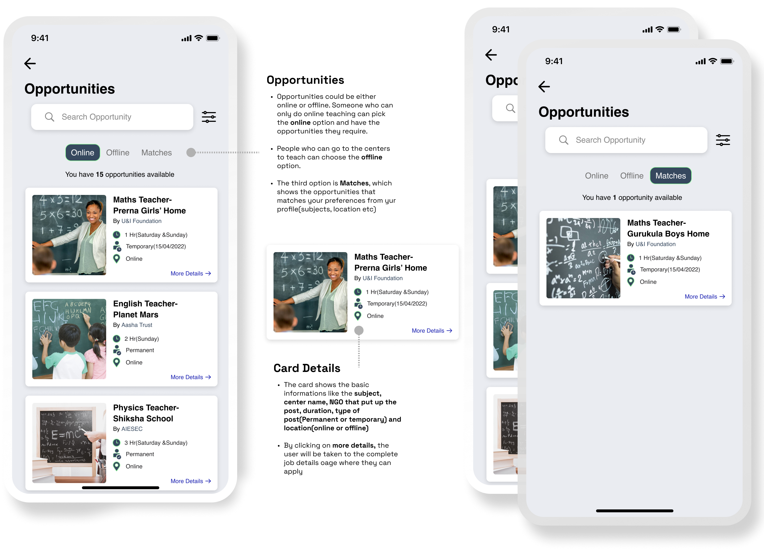
- Cards: different card types for opportunity lists, matches, and classes, with clear CTA hierarchy.
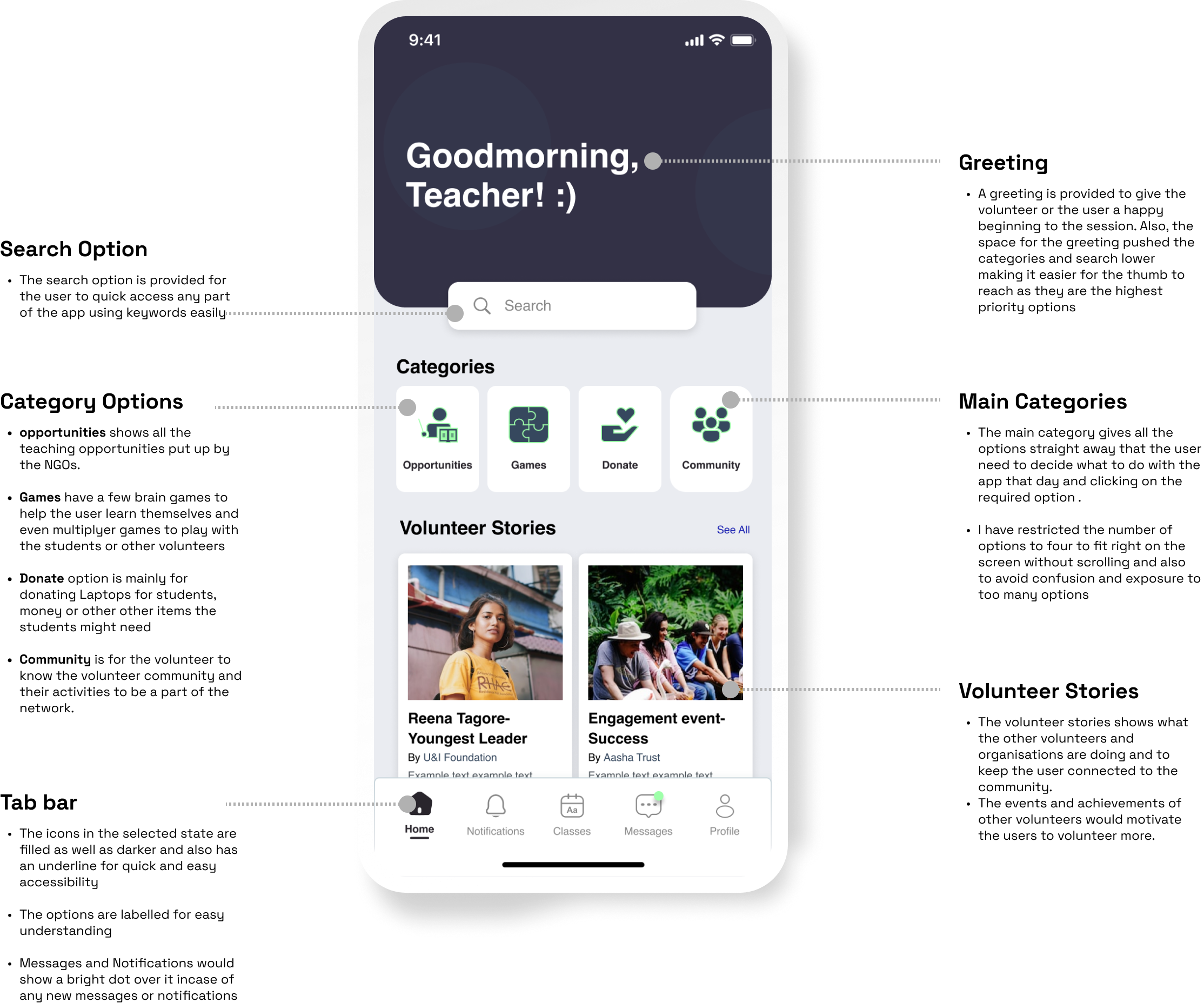
- Tab bar: limited to 3–5 items to reduce cognitive load.
Visual direction
Color palette: vibrant yet subtle, to keep the app lively but professional. Typeface: Helvetica, for clarity and neutral readability.
Final screens
Final screens
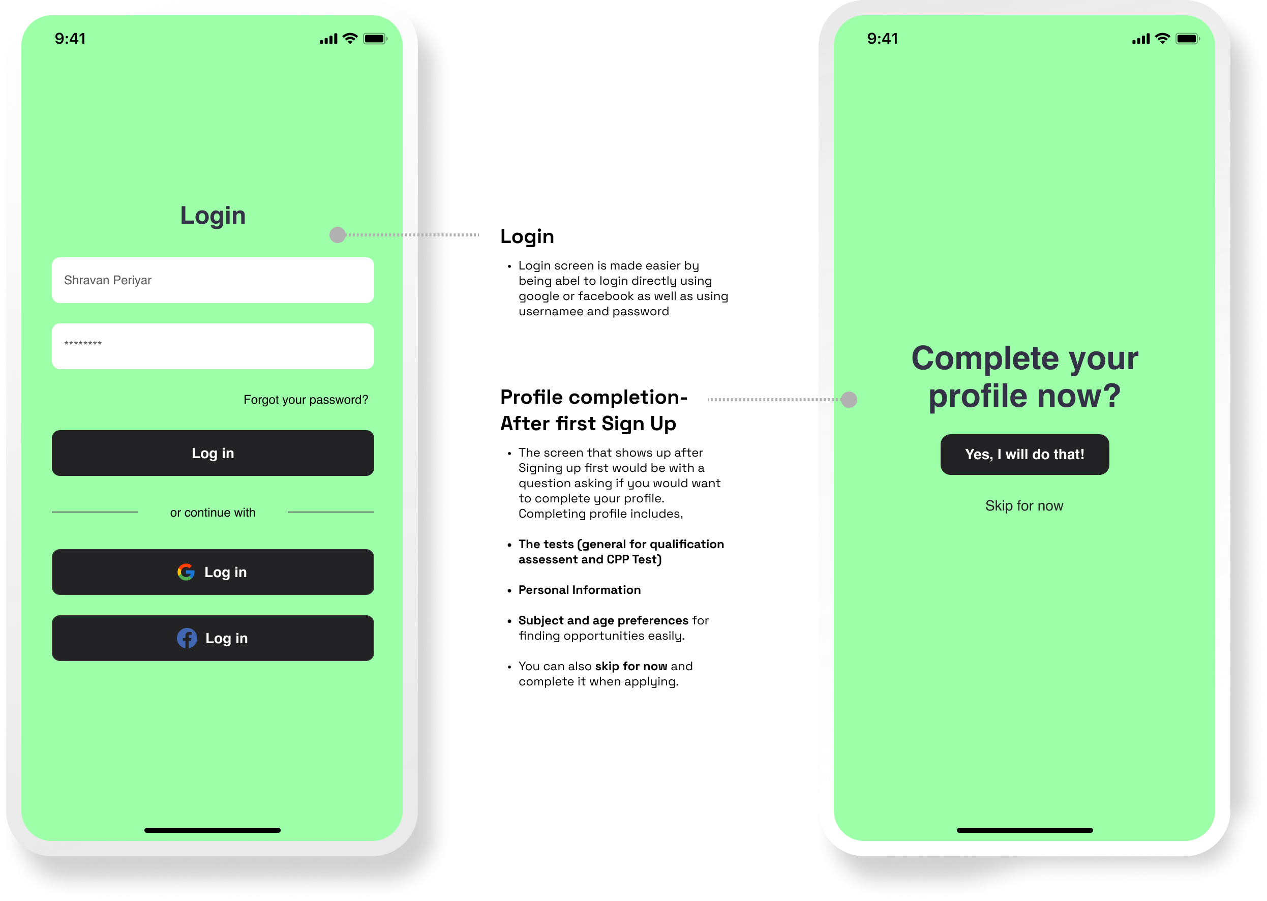
Login & Sign Up
Home
Opportunities
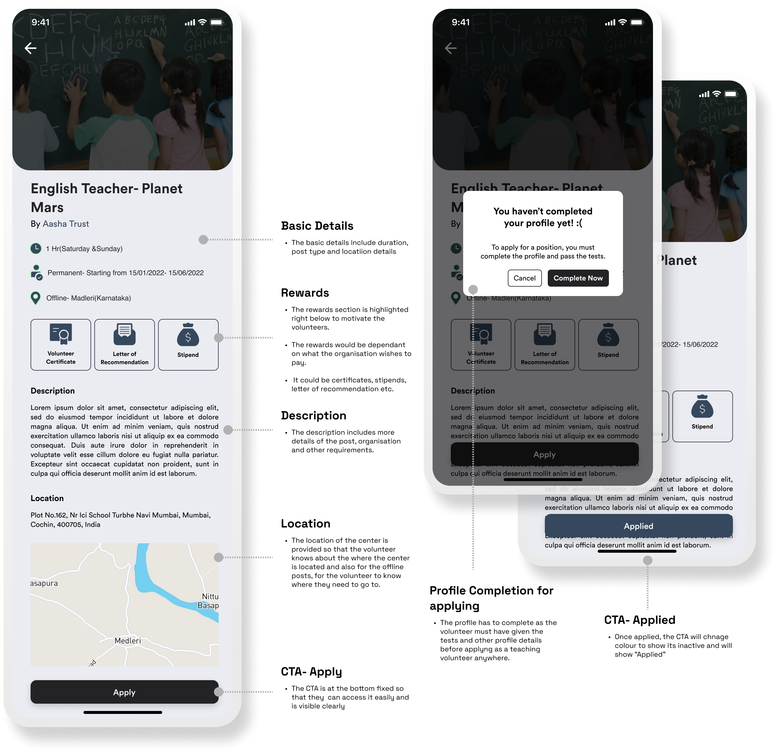
Opportunity Details
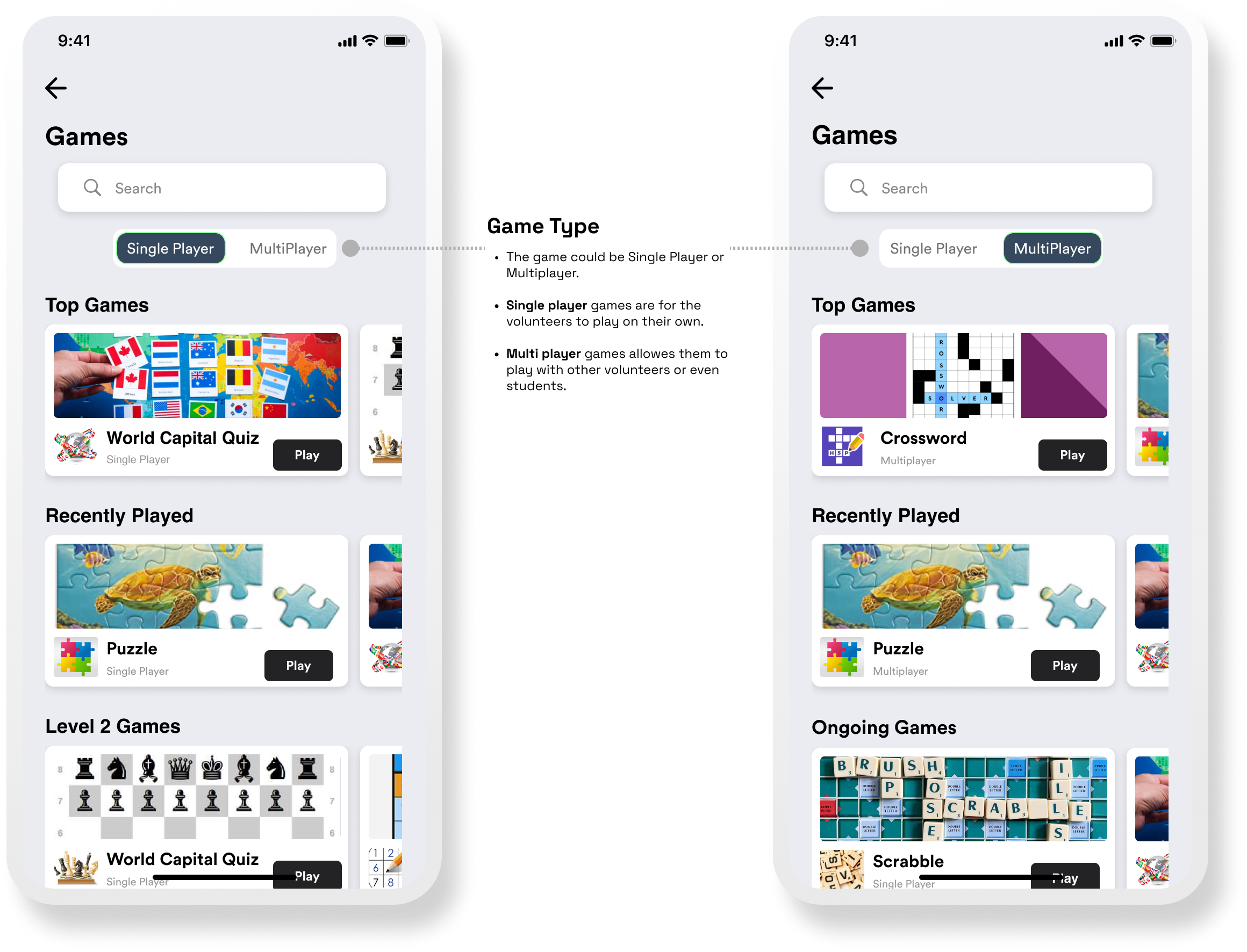
Games
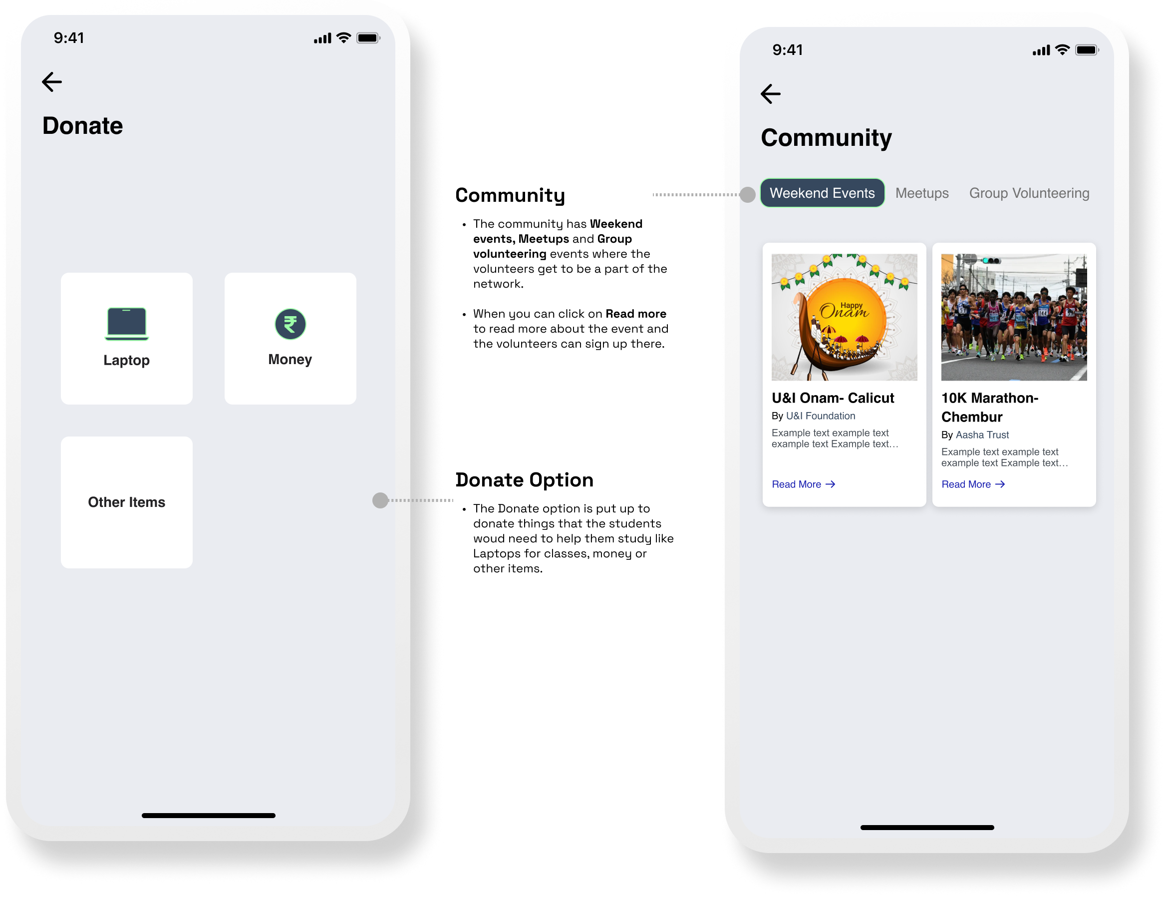
Donate & Community
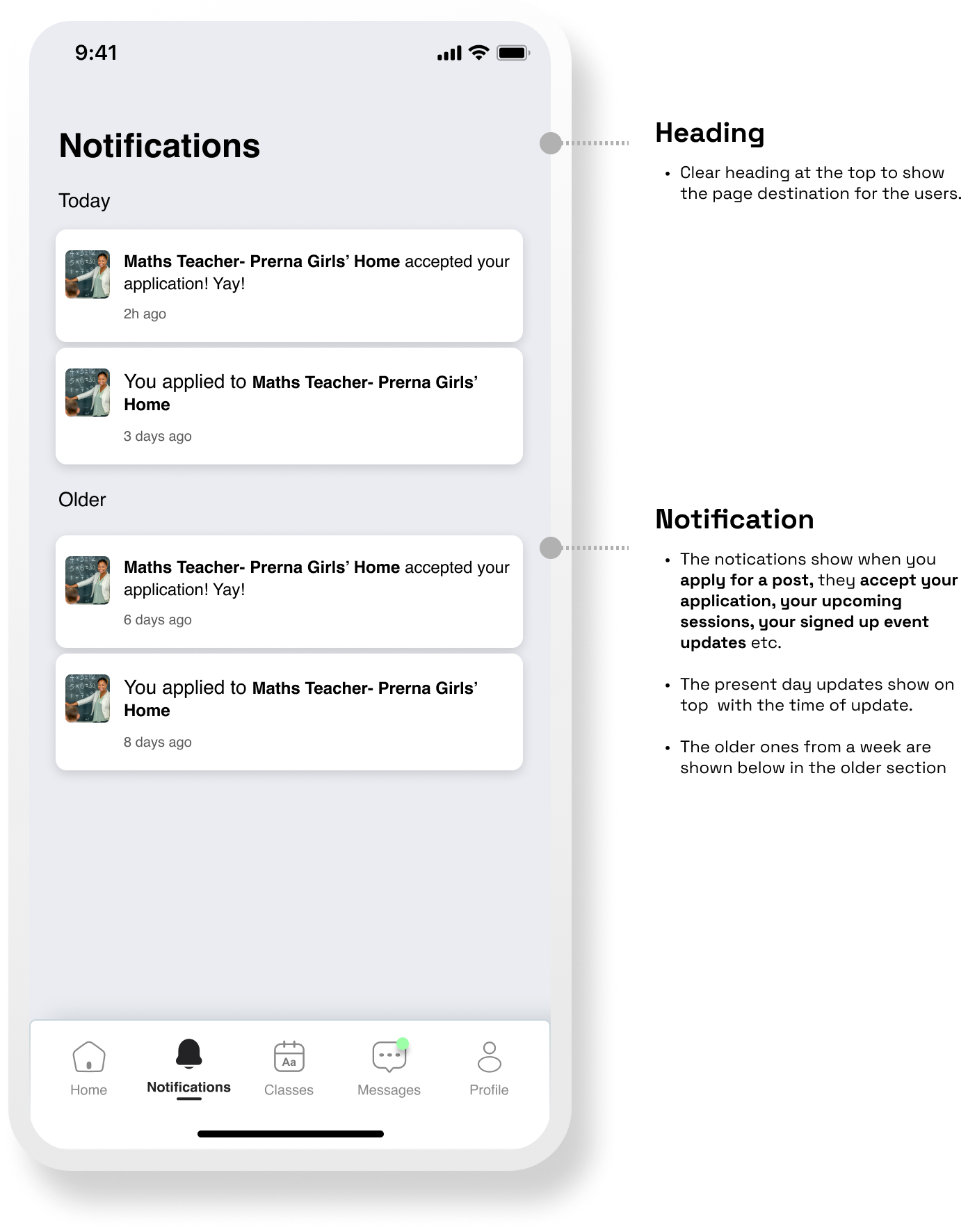
Notifications
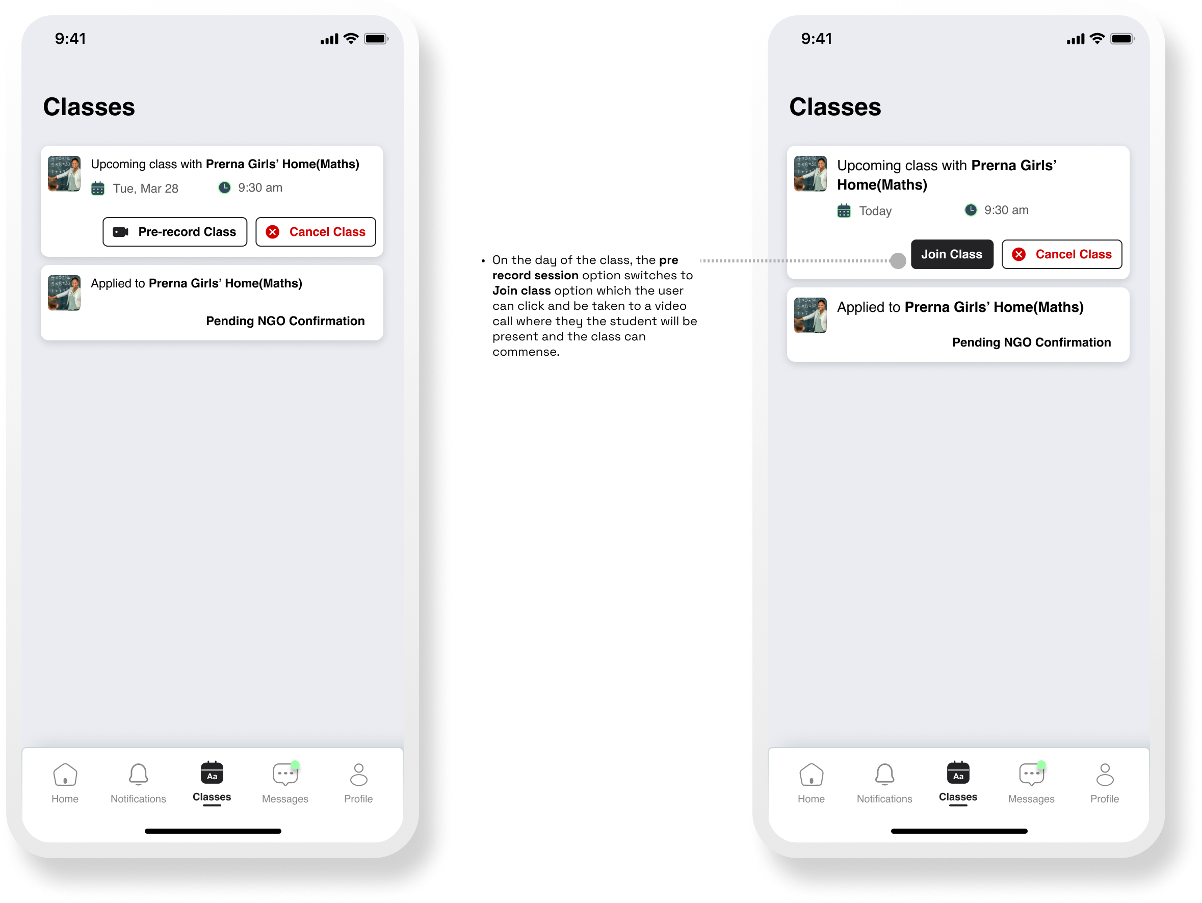
Classes
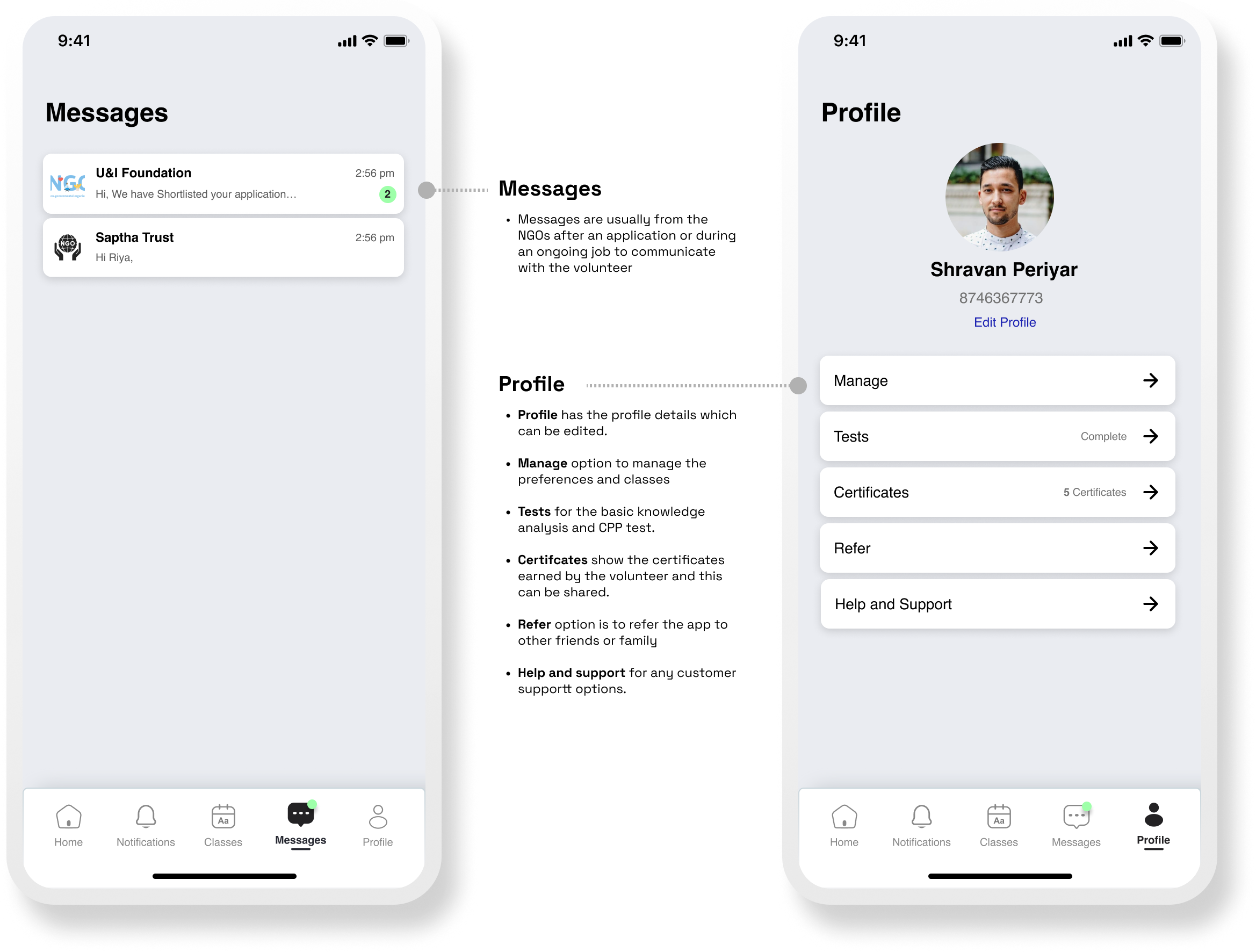
Messages & Profile
Testing & refining
Testing & refining
I ran usability tests with three participants who completed key tasks (apply for an opportunity, view status, cancel an upcoming session). Key feedback and changes:
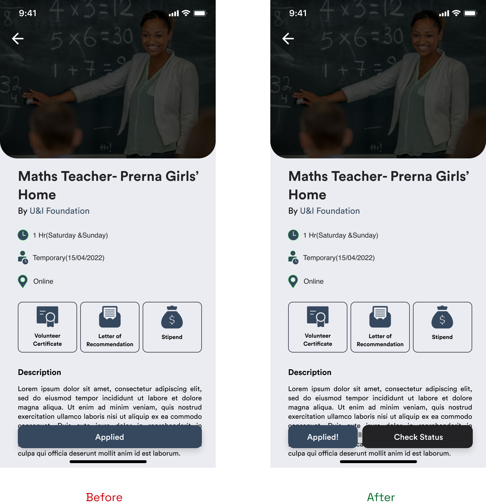
"After applying, we don't know where the status of the application will be seen."
→ Added a clear "Status / Classes" pathway and a button next to Applied to take the user to the Classes screen.
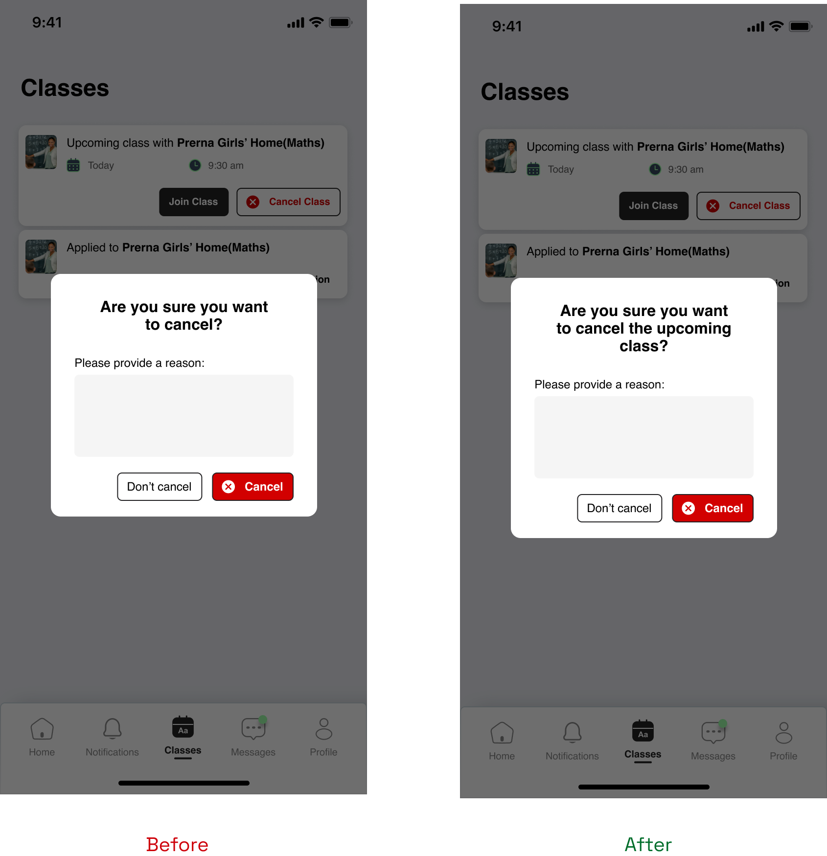
"How will I know if I am cancelling the next class or the entire job?"
→ Changed copy to confirm: "Are you sure you want to cancel the upcoming class?"
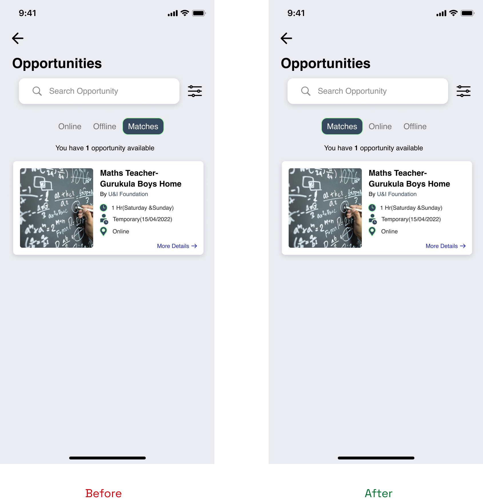
"The matches option should be first so that we know if there are any matches first..."
→ Moved Matches to be the default landing content so users see matches first.
After these refinements the flows were clearer, and users felt more confident applying and managing their volunteer commitments.