Go Back To Home
CLEARISK · CX PORTAL — ONBOARDING REVIEW · B2B SAAS

Improving productivity on a live onboarding review workflow (B2B SaaS)

I co-built CX Portal's design system as one of two designers on the product. Months after launch, I sat in on two live reviewer sessions to see how the screen actually held up under daily use — and found four small frictions quietly costing the team time on every application. Here's what I found, and why each fix works.

My contribution Design system (co-creator) · Workflow observation · Flow diagnosis · Interaction design · UI design
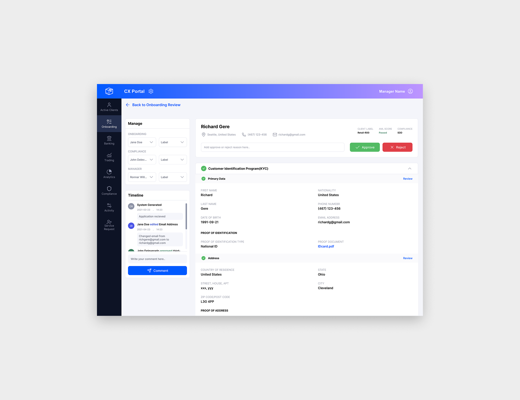
CX Portal review screen showing a client's onboarding application, with an approve/reject comment field and a Timeline audit trail
Project overview

A trade-processing platform built to replace a patchwork of tools

CleaRisk is a derivatives trading platform offering trade processing and client lifecycle management for financial institutions. CX Portal brings onboarding, back-office work, documents, and agreements into one product — replacing a patchwork of disconnected tools.

I joined as one of two UX/UI designers, co-building the design system alongside every screen we shipped. Once live, my role shifted from designing new screens to watching how shipped ones held up under real, daily use — this case study is about the morning that shift mattered most.

Role
UX/UI Designer & design system co-creator
Focus
The client review screen inside Onboarding
Constraint
Already shipped — not a redesign
Scope

This screen was already built and shipped. The brief wasn't "redesign it" — it was to reduce friction and improve productivity for the review team within the existing system, and add only what was absolutely required. I'm under NDA on this product: everything shown here is rebuilt with placeholder data, real structure and logic, no real client or company information.
Role Details

Other feautures I worked on at Clearisk

Documents

Added and manage documents for clients, inside the client portal.

Subscriptions

Worked partly on the subscriptions feature.

Roles & Permissions

Redesigned Admin's Roles & Permissions, new features, role-based visibility and access, and other customisations.

CX Dashboard

Built from scratch, research to design, a role-based dashboard for daily task management, cutting reliance on email and Slack.

NDA

The rest of this work is under NDA, so from here I'm only able to walk through the review screen work in detail.

01 — Issues

A working screen, an underperforming workflow

Nothing on the screen was broken in a way a heuristic checklist would catch. So instead of an audit, I sat in on a screenshare with two compliance reviewers, twice, a week apart, each with a different reviewer — so I wasn't reading too much into one person's habits.

Issue 1

A rejected application carried no record of why — and that cost the team time downstream

"This application was rejected yesterday. Why was this rejected?"

Review page users
  • Compliance — 2 reviewers, depending on availability, for individual sections.
  • Manager — for the main application.

Review page logic

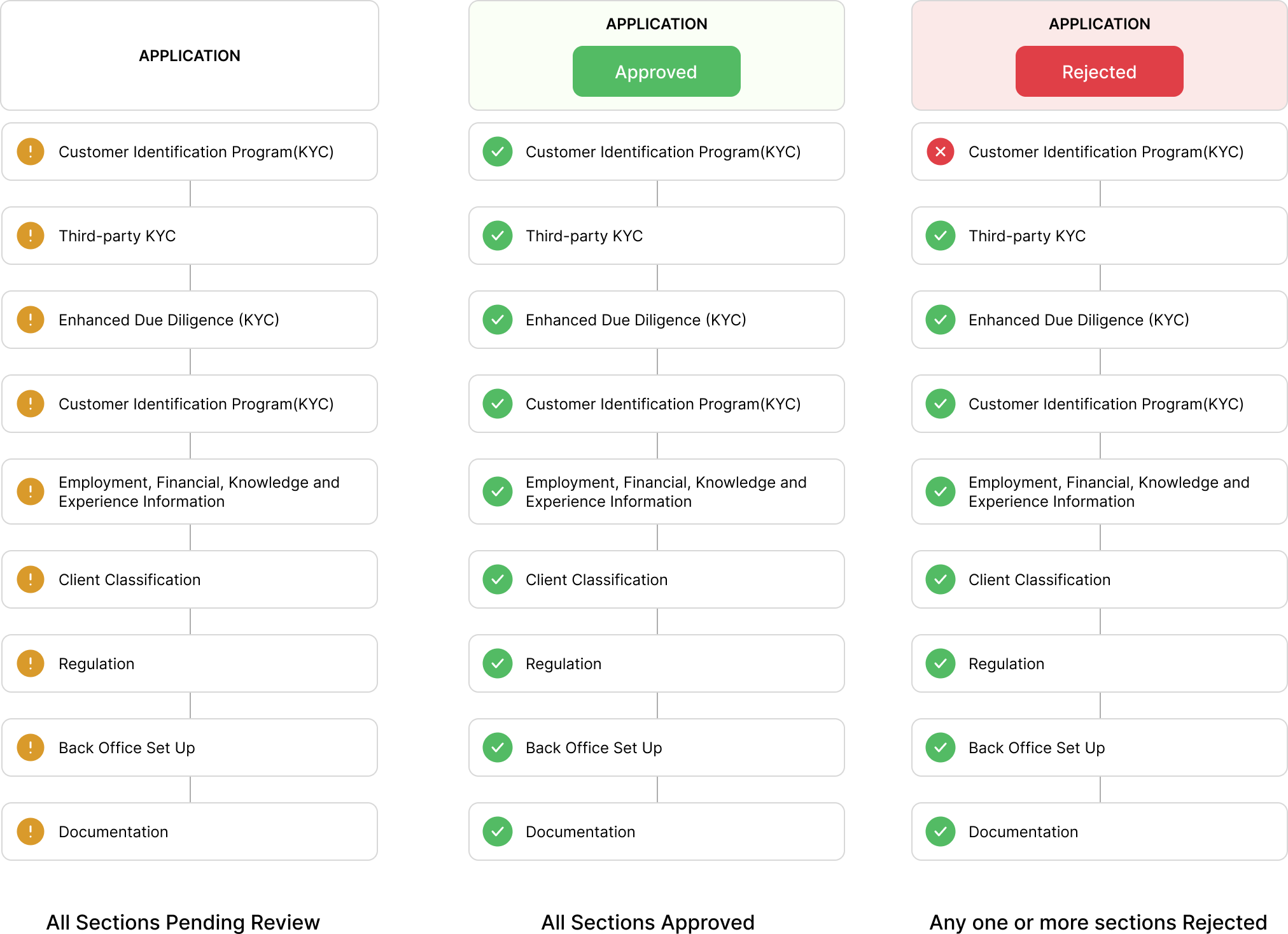
How the six review sections map to reviewer roles, and how their individual decisions roll up into one approve or reject outcome on the application.

Diagram of the review page's logic: six sections reviewed independently by Compliance and the Operations Manager, rolling up into a single approve or reject decision on the main application

Current flow with friction

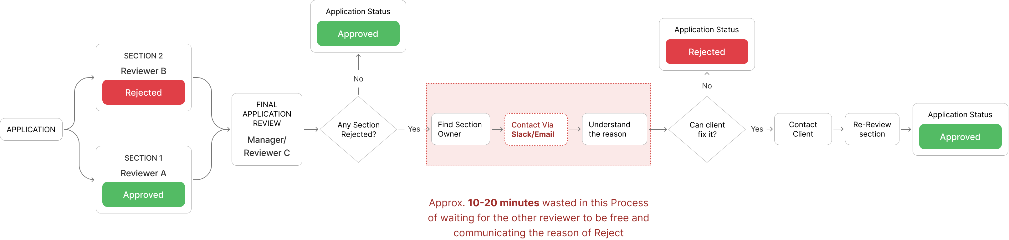
What happens today when a single section gets rejected: the whole application fails, with no reason passed to whoever picks it up next.

Current rejection flow: a single rejected section rejects the whole application with no reason attached, sending it back into the queue for a different role to investigate
Where this actually cost time

Reassigned mid-review

A colleague inherits an already-rejected case with nothing explaining why.

Escalated days later

A manager asks about last week's rejection, and the reviewer has to reconstruct it from memory.

Tracing the rejection

Whoever investigates opens and checks every section themselves to find which one failed.

Redundant re-checks

With no reason attached, a section sometimes gets rechecked just to be sure.

Per day

Roughly 6–8 applications move through this loop on a typical day. At an average of ~13 minutes lost per case across these four scenarios, that adds up to about 1.5 hours of reviewer time daily — time a comment trail removes almost entirely. (Estimate from flow analysis, not a timed study.)

Issue 2

Fixing a section after review meant going to a developer

An hour later, she caught a typo in an already-approved field — but approved sections locked, with no way to fix it.

"How do I edit any of these details in case of a mistake?"
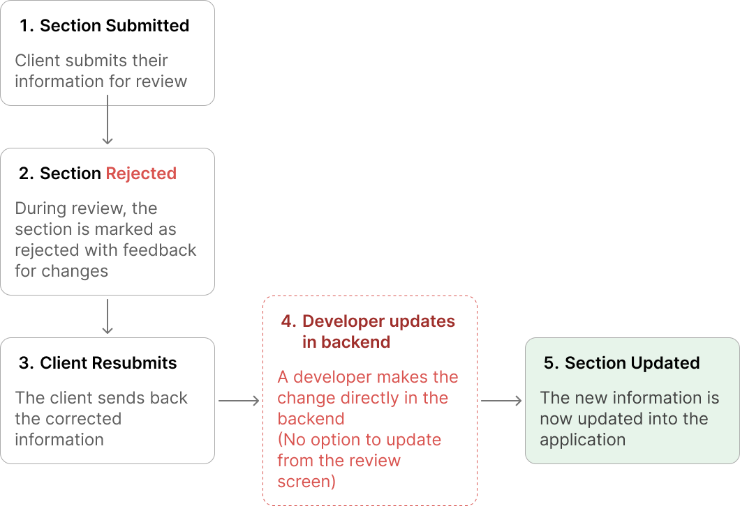
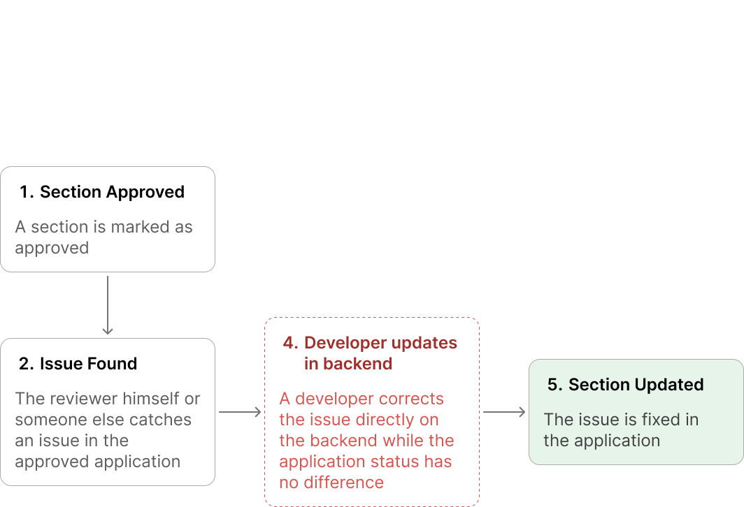
Diagram comparing the two cases that both currently require a backend developer fix: a rejected section resubmitted with corrected information, and an accidentally approved section caught after the fact

Once I looked closer, this wasn't a one-off. It came up in two different situations, and both were handled the same way — quietly, outside the app, by a developer.

Case 1 — client resubmits after rejection

Rejected section with the client's resubmitted, corrected information

A section gets rejected, the client sends back the corrected information, and it needs to go in. There's no way to update it from the review screen, so the change is made directly in the backend by a developer.

Case 2 — Error caught after approval

Section marked Approved by mistake, with no in-app way to reopen it

A section gets approved by mistake, and someone catches it after the fact. Same dead end: nothing in the app can reopen it, so a developer corrects it directly in the backend instead.

Where this actually cost the team

Blocked on engineering

The application can't move forward until a developer has time to make the fix — sometimes a day or more, for something the reviewer could've corrected in seconds.

Delay

No trail of the change

Once the fix lands, nothing on screen shows a correction was ever made — or what it replaced.

No record

Second-guessing what's real

When a detail doesn't match what someone remembers reviewing, there's no way to tell whether it was a backend fix or an actual error — so it gets re-checked just in case.

Confusion

Review logic gets bypassed

A backend edit skips whatever checks the review screen normally enforces, so an incorrect fix could go in without anyone catching it.

Unchecked risk
Issue 3

The PDF viewer opened as a popup over the review popup, so cross-checking meant switching back and forth

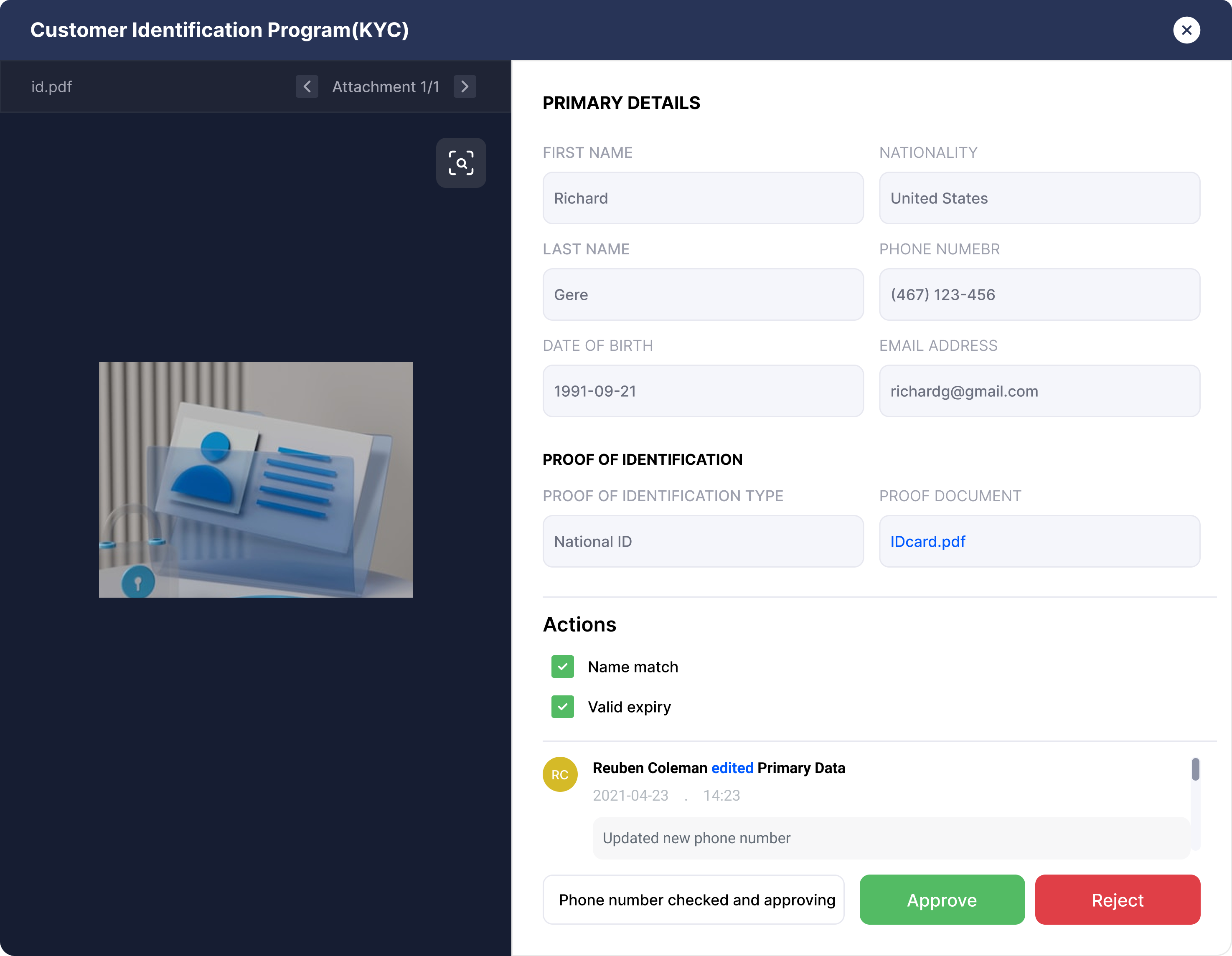
Each application section opens in its own review popup. When that section has a PDF attached, clicking it opens the PDF viewer as a second popup, layered directly on top of the first. To cross-reference something in the PDF against a field on the review form, the reviewer has to keep switching between the two — closing the PDF to see the form, reopening it to check the PDF again, back and forth for as long as the comparison takes.

PDF view on the application main page

Same PDF view pop-up used for the review pop-up

Where this actually cost the team

Lost train of thought

Every switch breaks whatever the reviewer was mid-way through checking, so they have to re-orient before continuing.

Interruption

Repeated three or four times

The same close-reopen motion isn't a one-off — it repeats for nearly every PDF, on nearly every section.

Repetition

Comparing from memory

With the PDF and the form never on screen together, small mismatches between the two are easy to miss.

Error risk

Read as normal, not broken

Reviewers had stopped noticing it as friction — it had just become how checking a PDF worked.

Normalized

I moved the PDF viewer out of the popup stack entirely: it now opens into a fixed left pane, with the review form staying visible on the right, using an existing split-panel pattern. Comparing two things shouldn't mean taking turns looking at them.

02 — Solutions

Improving the workflow without interrupting existing work

Each fix below reuses a component or pattern already documented in CX Portal's design system — nothing here needed a new visual language.

Fix 01

Introducing a Timeline feature

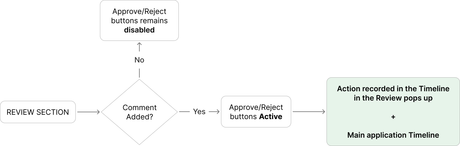
Every Approve/Reject now requires a comment, surfaced with a timestamp so any handoff carries its reasoning

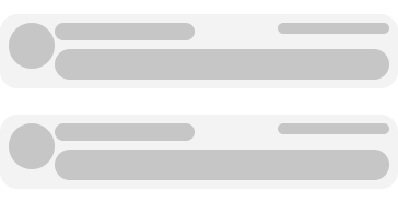
Timeline feature, version 1 exploration

Version 1

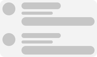
Timeline feature, version 2 exploration

Ver 2

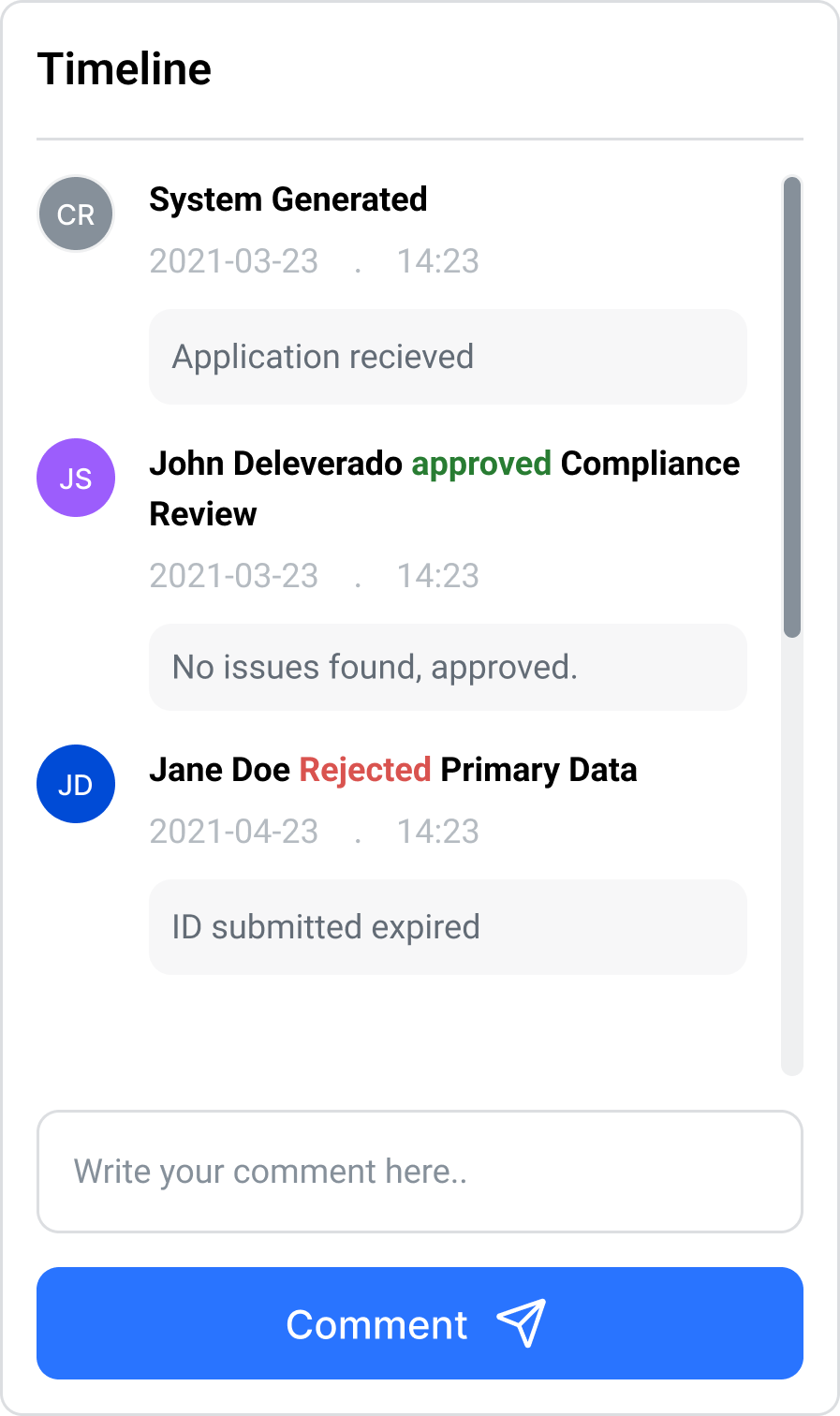
Timeline feature, version 2 exploration

Final version

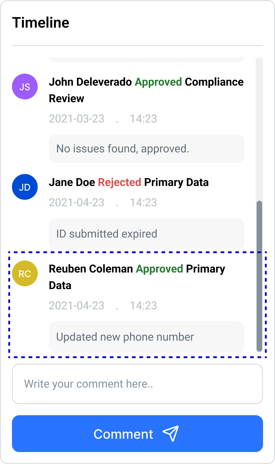
Timeline entry logged after a section is approved or rejected
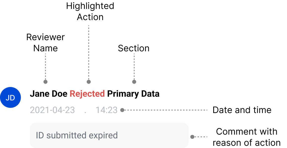
Timeline entry showing the comment, timestamp, and reviewer name

How a comment moves once it's submitted: logged against the section first, then rolled up into the main application's own Timeline.

Diagram of the Timeline's logic: a section-level comment is logged first, then rolls up into the main application's Timeline

Where the Timeline appears

The Timeline sits wherever someone would actually need it: the moment they open an application, so they can see everything that's happened on it, with the time and details — and again inside a section, so whoever's reviewing it can check what's already been done there.

Timeline locations
  • In the review pop-up — logged against the section as it's approved or rejected.
  • On the main application — outside the pop-up, rolled up for the application as a whole.
Where this actually helped

Faster handoffs

Reassigned reviewers pick up exactly where the last one left off — no lost context, no wasted cycles.

No more chasing answers

Managers get their answer straight from the Timeline, instead of pulling a reviewer off their queue.

Rejections are traceable

Investigating a rejection is a scan of the Timeline, not a section-by-section search.

Trust over re-checking

Redundant re-checks are gone — reviewers trust what's already logged instead of re-verifying it.

Fix 02

Making the sections editable

Making sure that there is always a way for a reviewer to edit a section before and after reviewing it

First iteration

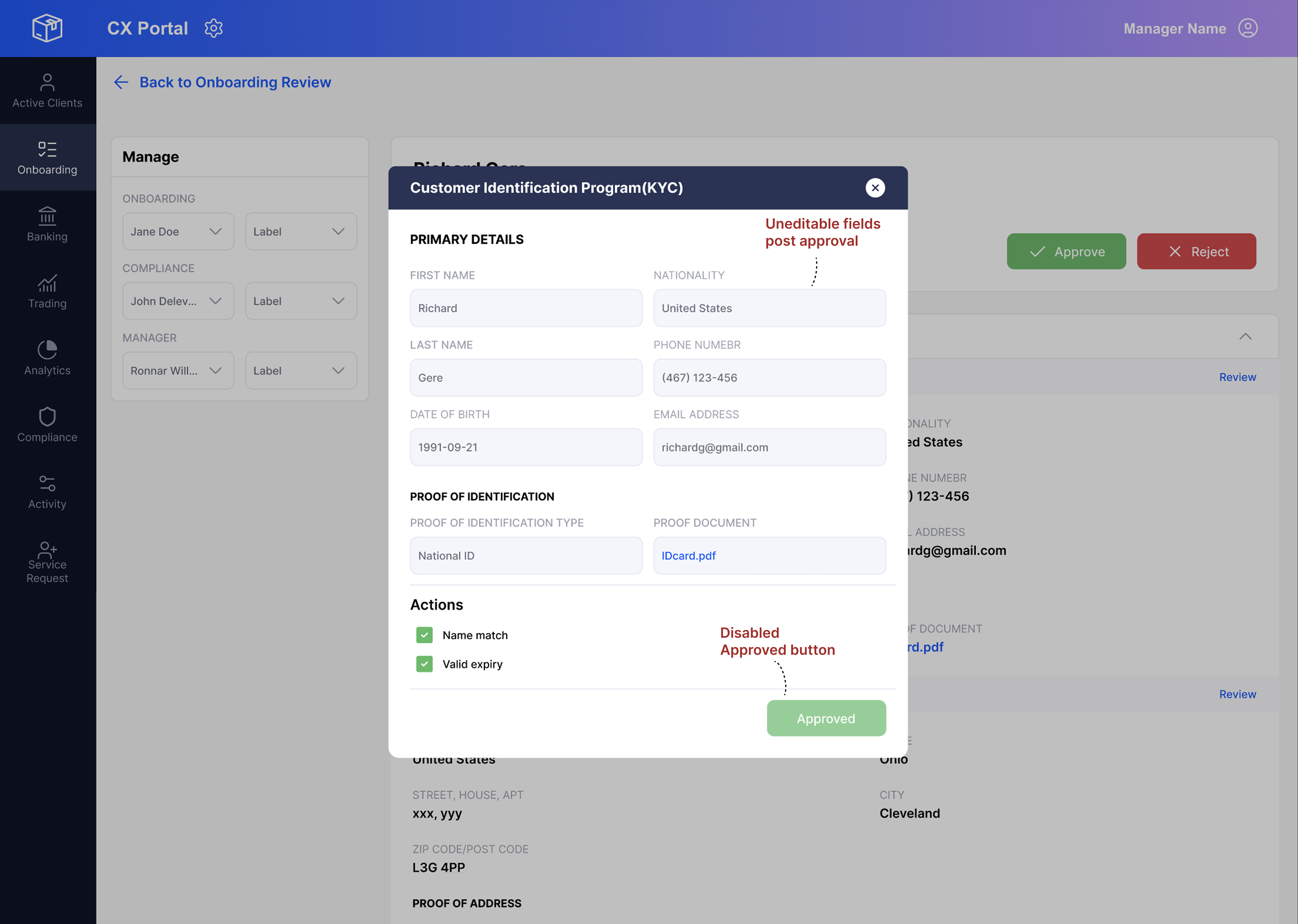
Made the text fields editable anytime

The review pop-up's text fields were made editable, and the disabled Approved button changed to Approve / Reject the moment a field was changed. So the flow became: change the text in the field, add a comment about the change, then Approve or Reject.

Why

It didn't need any major changes, and took very little developer time to build.

It tested clean, then broke in practice

The first iteration was discussed with the team and tested — no issues turned up. But once it went live and real applications started moving through it over the following days, problems started showing up.

Reasons for failure

Timeline entry showing an approval message with the edit folded into it, rather than called out on its own
The edit had no focus of its own

The Timeline logged a message saying the section was approved, with the edit folded into that same message. Since nothing set the edit apart, it just read as a normal approval — and the edit itself went unnoticed.

Edits skipped a second look

With more than one person working on the same application, a change was approved right away, so it never got rechecked. And if a section was rejected for two separate reasons and someone fixed only one of them, there was no way to update just that part — leaving it unclear whether the section should now be approved or rejected.

There was a need for a different solution.

New design addressing the issues found

A new Edit button was added next to the Review button, opening its own separate pop-up.

New logic
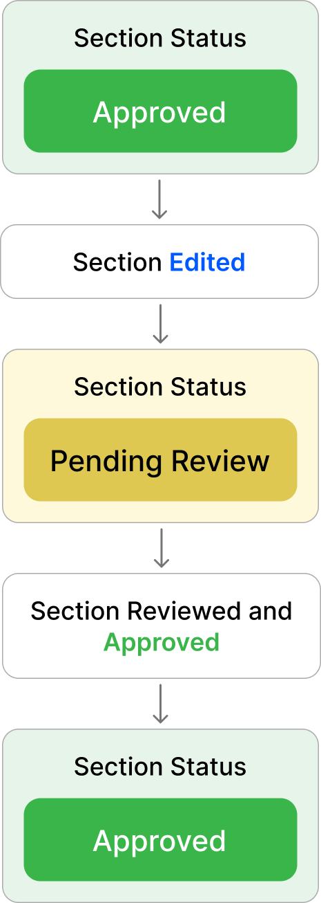
Diagram of the new Edit versus Review logic

Edit now opens as its own pop-up, separate from Review. Editing a pending section saves the change and keeps it pending. Editing a section that's already been approved or rejected saves the change too, but sends the section back to Pending — so it gets a second look before it's approved or rejected again.

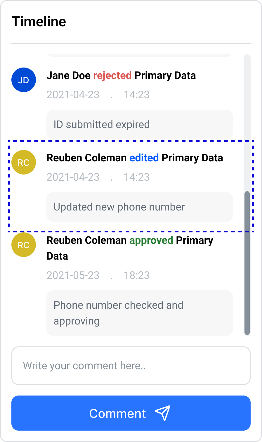
New Timeline entry showing Edited as its own logged action, separate from Approve or Reject
New timeline

The Timeline now logs "Edited" as its own action, instead of folding the change into an Approve or Reject entry.

Where this actually helped

Zero developer time

Reviewers correct mistakes themselves, in seconds — no more waiting on engineering for a one-line fix.

Fully auditable

Every change is logged against the section — nothing happens off the record anymore.

No more guessing

Reviewers always know whether they're looking at a correction or a fresh error.

Closed a compliance gap

Every edit now runs through the same review logic as everything else, instead of bypassing it.

Fix 03

Simple solution — pushed the PDF to the side

The PDF viewer moved from a stacked pop-up to a panel docked inside the review pop-up itself

Review pop-up with the PDF viewer docked in a side panel next to the section's fields, instead of opening as a separate pop-up on top

The PDF used to open as its own pop-up, stacked directly on top of the review pop-up — so checking it meant closing one to see the other. Now it opens inside the review pop-up itself, docked in a panel beside the section's fields. The document and the details it's being checked against sit on screen together, so the reviewer can compare them without ever losing sight of either.

Where this actually helped

Reviewers stay in flow

No more losing their place every time they need to check a document.

Real time saved

One open-close motion replaces three or four, on every section that has a PDF attached.

Fewer missed mismatches

Side-by-side comparison catches discrepancies that used to slip through unnoticed.

No more workaround

Cross-checking a document against a field is now just part of the flow, not a habit reviewers had to build around it.

03 — Impact

What four small fixes added up to

None of these changes touched CX Portal's visual language — each reused a piece of the system I'd already helped build. Individually small, together they removed steady friction from a workflow the compliance team ran dozens of times a day. Impact figures below are directional estimates from flow analysis, not a controlled study.

Fix Productivity impact  
Comment log Removes roughly one out-of-system message (Slack or email) per reassigned application  
Edit + re-review Turns an unsupported error state into a two-click fix, no manager escalation needed  
Split document view Cuts roughly three open/close popup cycles per section down to a single persistent view  
Employee upload Replaces a problem that used to need backend support with a simple employee upload  
04 — Reflection

What I'd do differently with more room

The problems weren't visible until I watched, not audited. Nothing here would've shown up on a heuristic pass — they only became visible by sitting with two reviewers and noticing where they slowed down, backtracked, or reached for a workaround without commenting on it.

A team walkthrough isn't the same as production. The first version of Fix 02 was discussed with the team and tested with no issues found — it only broke once real applications moved through it with more than one person editing the same section. I'd want to stress-test a design against concurrent, overlapping use before calling it done, not just the happy path one person walks through.

The costliest friction is the kind nobody flags anymore. The PDF pop-up-over-pop-up problem had been there long enough that reviewers had built a habit around it and stopped calling it out as broken. Habituated friction doesn't show up if you only ask what's frustrating — it shows up when you watch someone do the same awkward motion for the fourth time without seeming to notice.

Working inside a shipped system is its own discipline. The brief was to reduce friction, not rethink the flow, and every fix had to reuse a pattern already in the design system rather than introduce a new one. Co-owning that system made it easy to work inside it — but the real constraint was resisting the urge to redesign something just because a better version was possible.