Rebuilding a fragmented dual-sided marketplace for a scalable launch
I audited and rebuilt Sportscove's learner and coach experiences, introducing a shared design system and redesigning the core discovery, booking, and onboarding flows for launch.
My contributionUX audit · Research synthesis · Information architecture · Interaction design · Design system · UI design · Prototyping
Project overview
A startup preparing to launch its first product on a tight deadline
Sportscove is a sports coaching marketplace connecting learners with coaches across the US, Canada, and India. Three months out from launch, the incomplete platform needed a full product and UX audit to become scalable and launch-ready.
Role
UX/UI Designer
Timeline
3 months to launch
Team
2 designers, 3 developers, CEO & advisors
Constraint
We had three months to launch, so I prioritised core marketplace flows, reusable infrastructure, and high-risk interaction states over lower-impact polish.
01 — Diagnosing the product
Before redesigning the product, I needed to separate what worked from what didn't
The product had screens and partial flows already in place, but it wasn't clear whether the gaps were isolated or symptoms of something bigger — so before designing anything new, I audited what existed to find out.
Existing research
Learner + coach interviews
Product audit
Screen & flow gaps
Usability review
Journeys + heuristics
Competitive review
Skillest, CoachUp, ADPList
What existing research told us
With launch three months out, I used the team's existing learner and coach interviews as a starting point rather than restarting research from scratch.
Existing interviews provided directional insights but lacked behavioural depth.
I supplemented them with product auditing, usability findings, competitive benchmarking, and stakeholder discussions.
Because launch was three months away, I focused research effort on decisions that could materially change the product.
A few of the questions I would have changed across both interviews, not the full list.
Learner research
What they askedWhat I would ask instead
✕"If you could design an app for training with certified coaches, what features would you want?"
✓"Tell me about the last time you tried to improve at your sport. What did you do?"
Why
A wishlist of features reveals what people think sounds good, not what actually helps them improve — a real attempt surfaces what they tried, what worked, and where they got stuck.
✕"Do you think learning in a group would be beneficial for you?"
✓"If you were booking a coaching session for your sport, would you want it to be one-on-one or with other learners? What would make you choose one over the other?"
Why
A yes/no question about whether group learning is "beneficial" asks users to evaluate an abstract idea. Asking them to imagine an actual booking decision makes the choice concrete and reveals why they prefer one format, whether that is individual attention, learning from others, social interaction, cost, or something else.
✕"What factors would make you choose one coaching platform over another?"
✓"Tell me about the last time you were deciding between a few different coaches. What made you hesitant about any of them?"
Why
Asked as "what factors would make you choose," this is hypothetical and invites a generic list like price or reviews — asking about real hesitation surfaces the actual trust gaps a coach profile needs to close.
✕"What do you look for in a sports coach?"
✓"Think about the last time you compared a few coaches before choosing one. Walk me through how you compared them, and what ultimately tipped it."
Why
A general checklist answer isn't tied to any real decision — walking through an actual comparison surfaces the process itself, which is directly useful for designing how multiple coaches get shown side by side.
Coach research
The coach interviews were more grounded in real coaching experience, but I would have pushed further into how coaches currently acquire, manage, and retain learners.
What they askedWhat I would ask instead
✕"What are your biggest challenges with virtual coaching?"
✓"Tell me about the last virtual session that didn't go as planned. What happened?"
Why
"Biggest challenges" invites a general, abstract complaint — a specific session surfaces the real friction point and exactly how it played out.
✕"What factors would make you choose one coaching platform over another?"
✓"How do you currently find students, and what does that process look like from first contact to booking?"
Why
Most coaches hadn't used a comparable platform, so comparing them was hypothetical — mapping their actual acquisition process reveals what a platform would genuinely need to support.
✕"What would your ideal sports coaching app look like?"
✓"What tools or workarounds do you currently use to manage your coaching?"
Why
"Ideal app" invites wishlist thinking disconnected from reality — current workarounds reveal what's actually missing and what they're already solving for themselves.
✕"What tools would you like to see to bridge the gap between virtual and in-person coaching?"
✓"If you teach more than one sport, tell me how you decide what to offer a new student, and how each sport shows up when someone's looking for a coach."
Why
Multi-sport coaching wasn't asked about at all, even though it later becomes a real design problem — how a coach's sports get shown on a card. Asking it here creates a direct line from research to that decision instead of the logic appearing out of nowhere.
The research gap I would have explored
Learners
1Sport
2Skill level
3Goal
4How they find coaches
5How they compare
6What builds trust
7What happens after booking
Coaches
1Sports taught
2Learner types
3How they find students
4How they manage sessions
5Marketplace frustrations
6What would make the platform valuable
This would help answer a larger product question:
Larger product question
Can one coaching experience work across sports, or does discovery and booking need to adapt to the learner's sport, skill level, and goal?
What I would have done with more time
1
Survey
Identify patterns across sports and user types.
2
Interviews
Understand the behaviours and motivations behind those patterns.
3
Segmentation
Sport × Skill level × Goal × Coaching format
4
Product decisions
Use those findings to determine what should be universal across Sportscove and what should adapt to each type of user.
What the product audit revealed
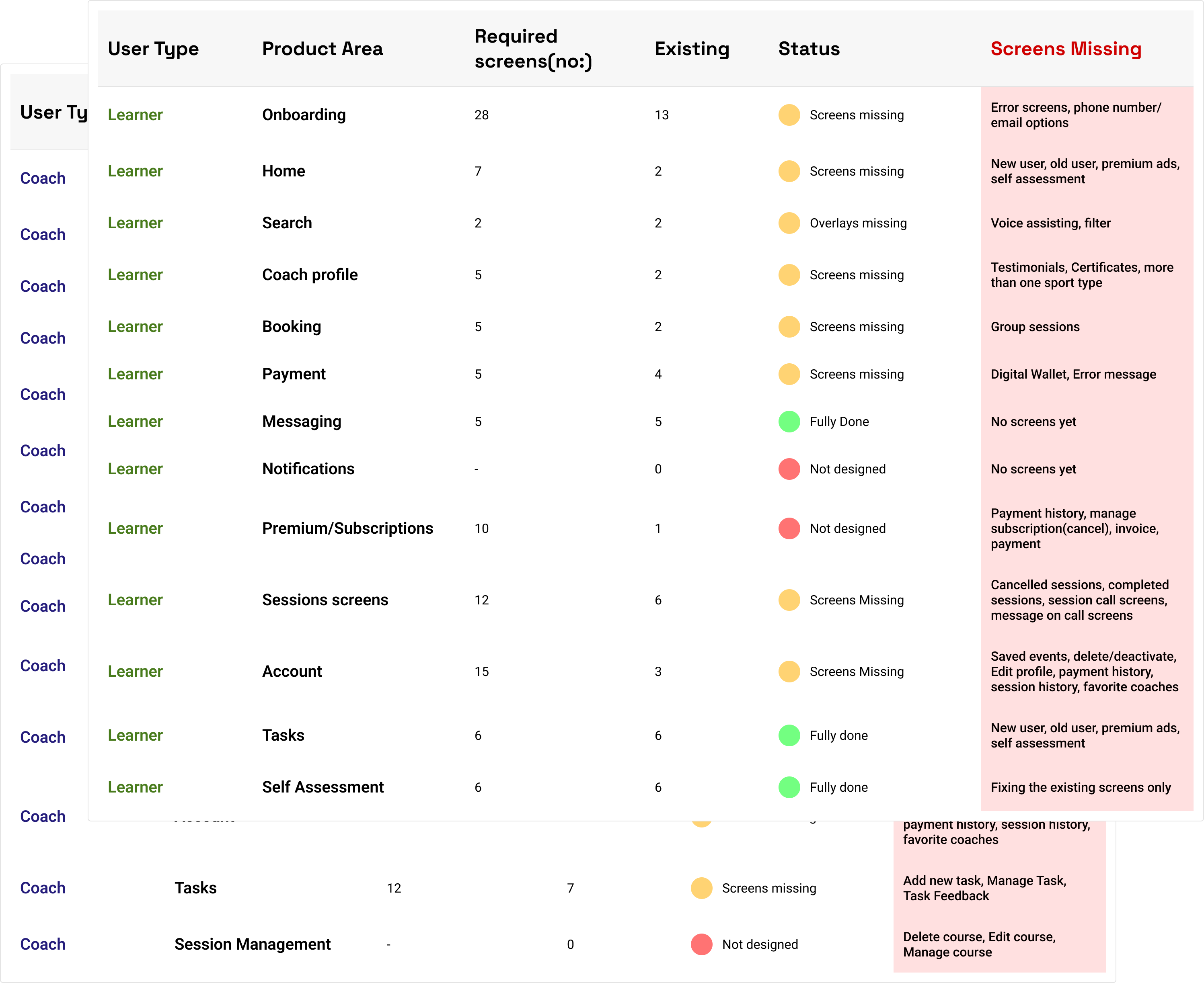
I audited the existing screens against the product requirements to flag what was complete, incomplete, or missing.
What I found
Incomplete end-to-end flows
Missing key product states (error, empty)
Gaps in session, task, and account management
Subscription experience missing key scenarios
Limited consideration for different user types and contexts (new vs. returning, active subscriptions, past activity)
Walking through the experience as a new user
I walked every core flow as a first-time user, against standard heuristics.
What I evaluated
Navigation & wayfinding
Consistency across patterns
Error prevention & recovery
Feedback & status visibility
Task completion & continuity
The end-to-end review surfaced patterns that isolated screens hid.
What stood out
Features existed but weren't accessible
Inconsistent wording across interactions
Same entity displayed differently
Key info placed before the decision
Visual styling varied across flows
Learning from the testing that had already been done
One quote from prior testing points directly at the problem the booking redesign later solves.
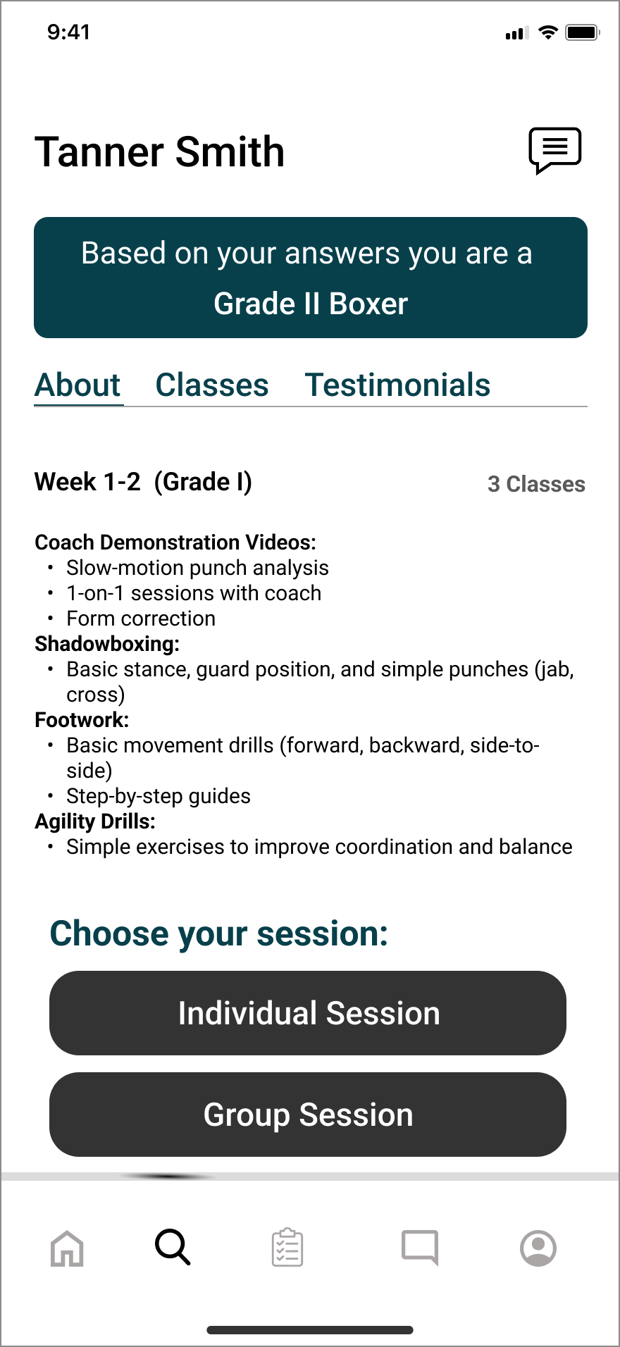
Learners wanted to see a coach before completing a self-assessment
Satyanshu Singh
"I don't want to do my self assessment now. Can I not just see the coach profile without it?"
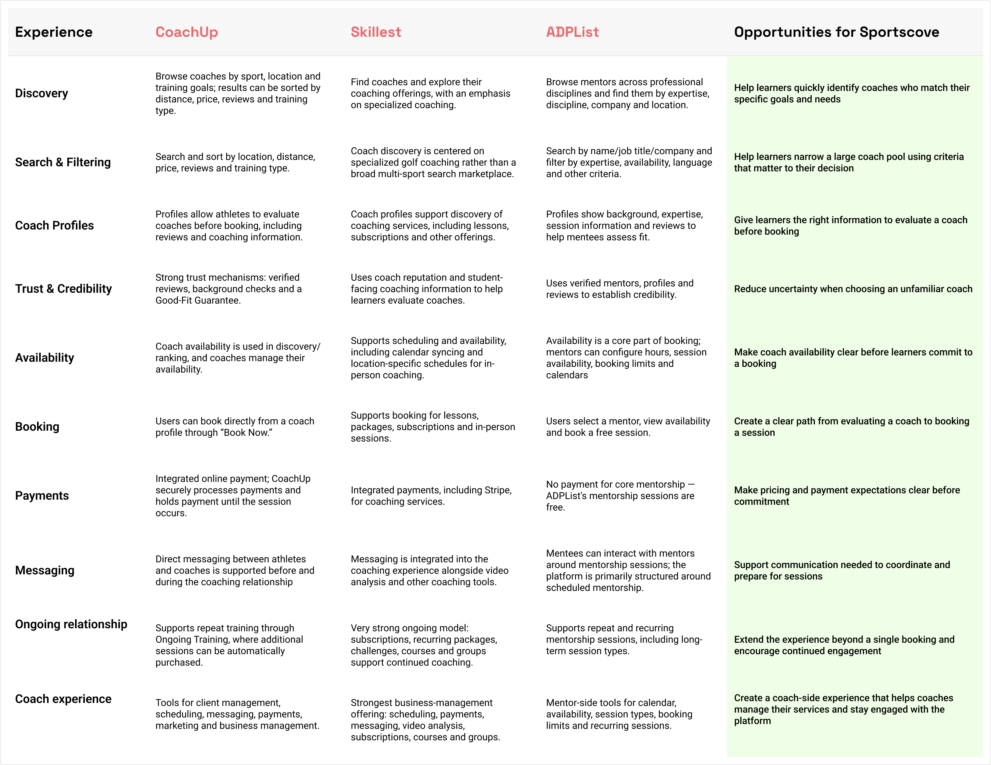
Competitive signals
Skillest and CoachUp were the closest competitors, with ADPList reviewed too for its similar (if not sports-specific) mentorship model.
What I found
How intuitive and complete the overall experience felt
What built a sense of trust
How accessible the experience was for different users
How well the platform supported ongoing use, not just a single transaction
How balanced the experience was for both sides of the marketplace
Straightforward discovery→Reduce pre-coach friction in booking
Clear ongoing relationship model→Consider the post-booking experience
Business constraints
I ran a prioritisation session with the CEO to rank flows by business impact, then synced with developers to confirm what was realistically buildable in three months.
Why the design system became the first priority, not an afterthought
CEO
"We need a system to maintain the design and make sure all screens look like they're part of the same app."
This made the design system a product priority rather than a visual cleanup exercise.
02 — Connecting the findings
What emerged was a product held back by four connected problems
A product and UX audit, benchmarking against comparable apps, and direct conversations with the CEO and developers surfaced four barriers. Every decision in this case study traces back to one of them.
01
System problem
No shared foundation
No shared components, colors, or patterns existed, so every screen was designed from scratch.
02
Learner problem
Core flows lacked clear interaction states
Inconsistent navigation and ambiguous interaction states meant people couldn't always tell what they'd selected — and booking itself was gated behind unrelated steps.
03
Discovery problem
Discovery didn't adapt to users
Accessible search for retired athletes and coaches, and logic for multi-sport coaches, weren't designed at all.
04
System / marketplace problem
Marketplace complexity wasn't represented
Gaps in the connection between learner and coach workflows, with key information missing across both sides.
FindingProduct implicationDesign response
No shared foundationNew screens would keep introducing inconsistencyBuild a design system
Booking had unnecessary frictionLearners hit a self-assessment before seeing coachesRework the booking flow
Search behaviour differed, and multi-sport coaches didn't fit existing cardsOne discovery pattern, and one static card, couldn't serve everyoneGuided/predictive search + filters, plus context-aware card logic
Coach onboarding only handled the happy pathCoaches could get stuck or lose workResilient onboarding
04 — Building the foundation
Introducing a foundation/system was the first step
A shared system for designing and building at speed.
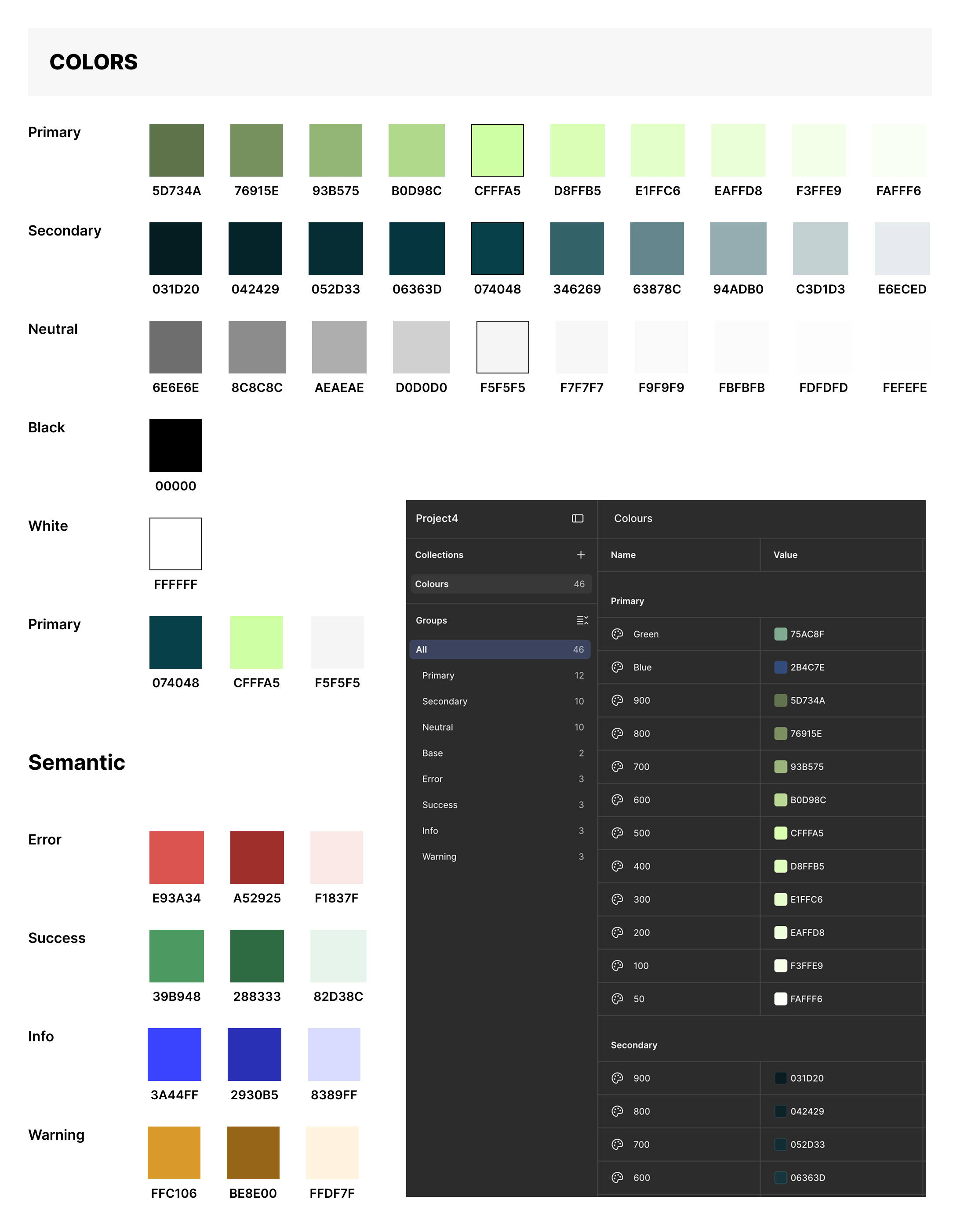
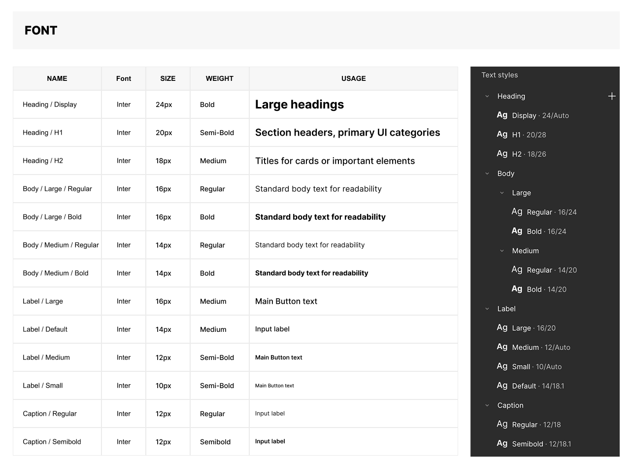
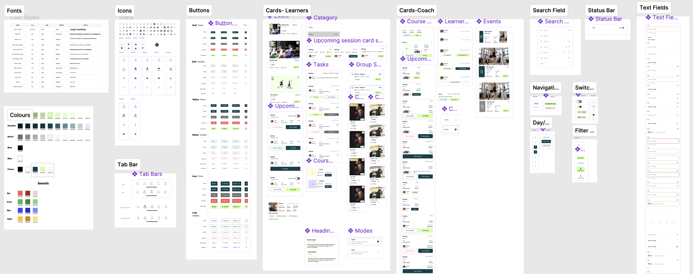
Design System
Consistency and efficiency at scale
Every new feature was solving the same visual and interaction decisions again, increasing inconsistency and slowing implementation. I established a shared design system with 60+ reusable components — color, typography, buttons, cards, and interaction states — so every screen designed after this reused the same foundation instead.
Impact:Reduced repetitive design work by standardising recurring patterns and states, giving developers a consistent implementation reference across the product.
05 — Simplifying the core transaction
Booking a coach shouldn't be the hardest part of a coaching app
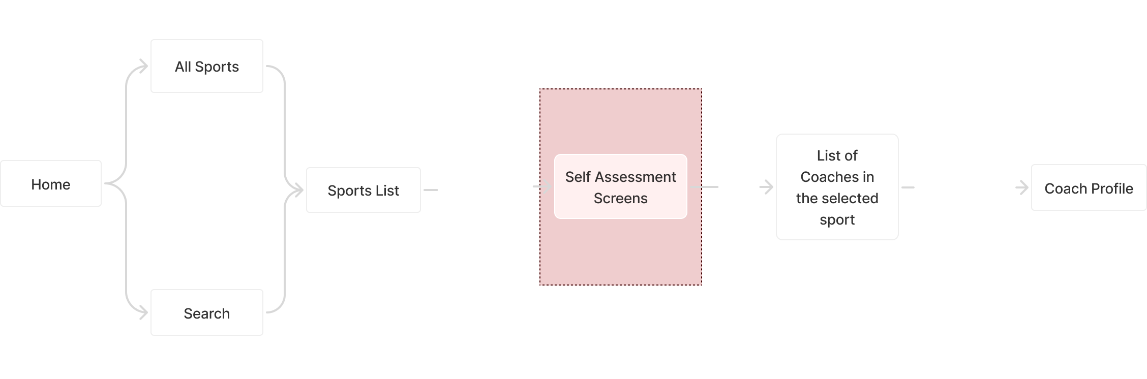
Booking was the platform's core transaction, but the old flow buried it behind a multi-page self-assessment before a learner could even see a coach's availability — a task that should have taken seconds took several detours instead.
The redesign separated "help me find the right coach" from "help me understand my coaching needs." The self-assessment wasn't the problem — its placement in the journey was.
Old session booking flow
User flow
Not working
Cluttered screens
Blocked path to coach
Sports split across 2 screens
No direct coach access
No skip option
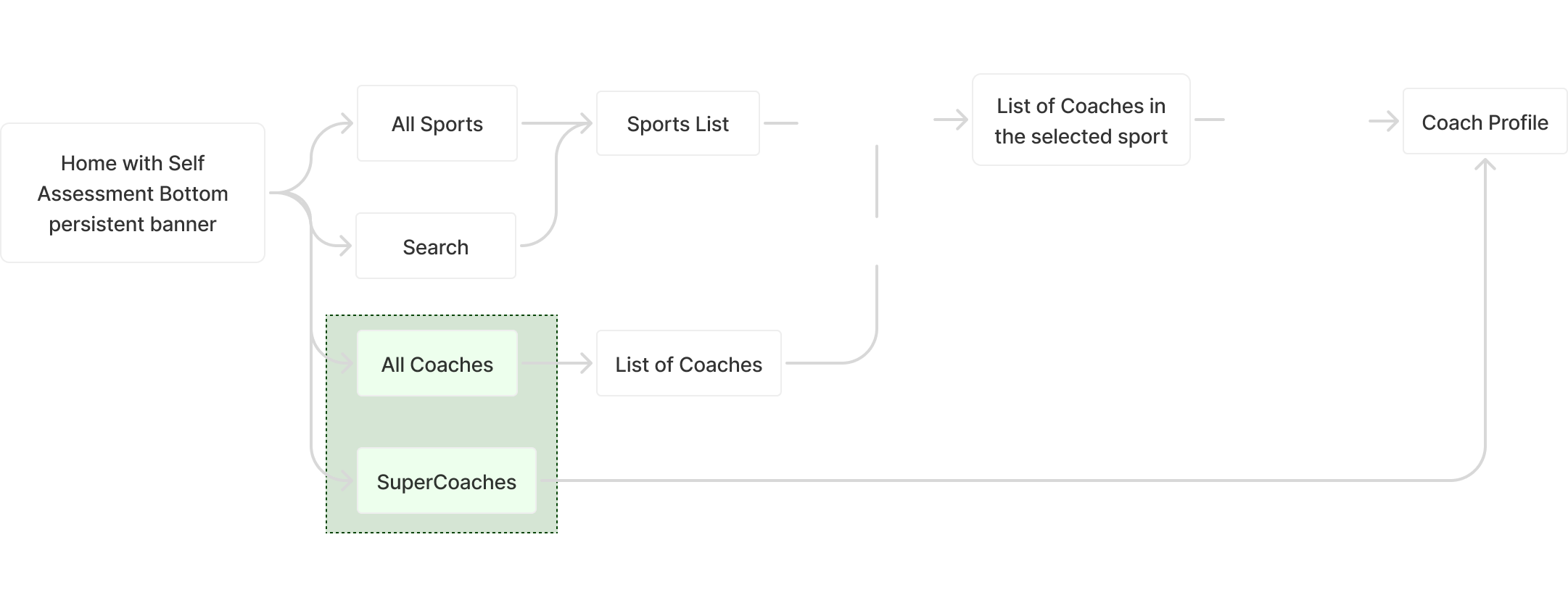
New session booking flow
User flow
What changed
Self-assessment as banner
Multiple entry points
Visual cleanup
Sports in 1 screen
Filters added
Key screens redesigned
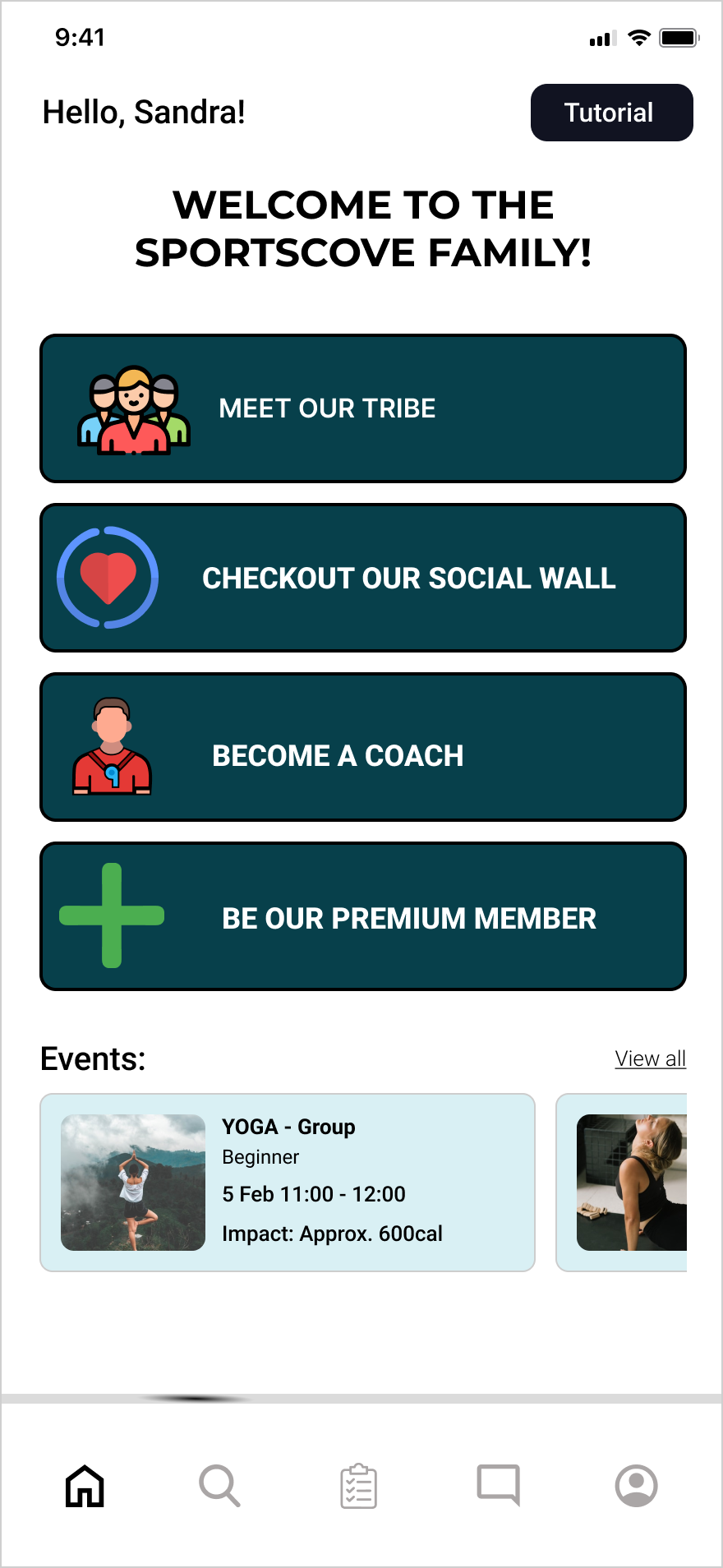
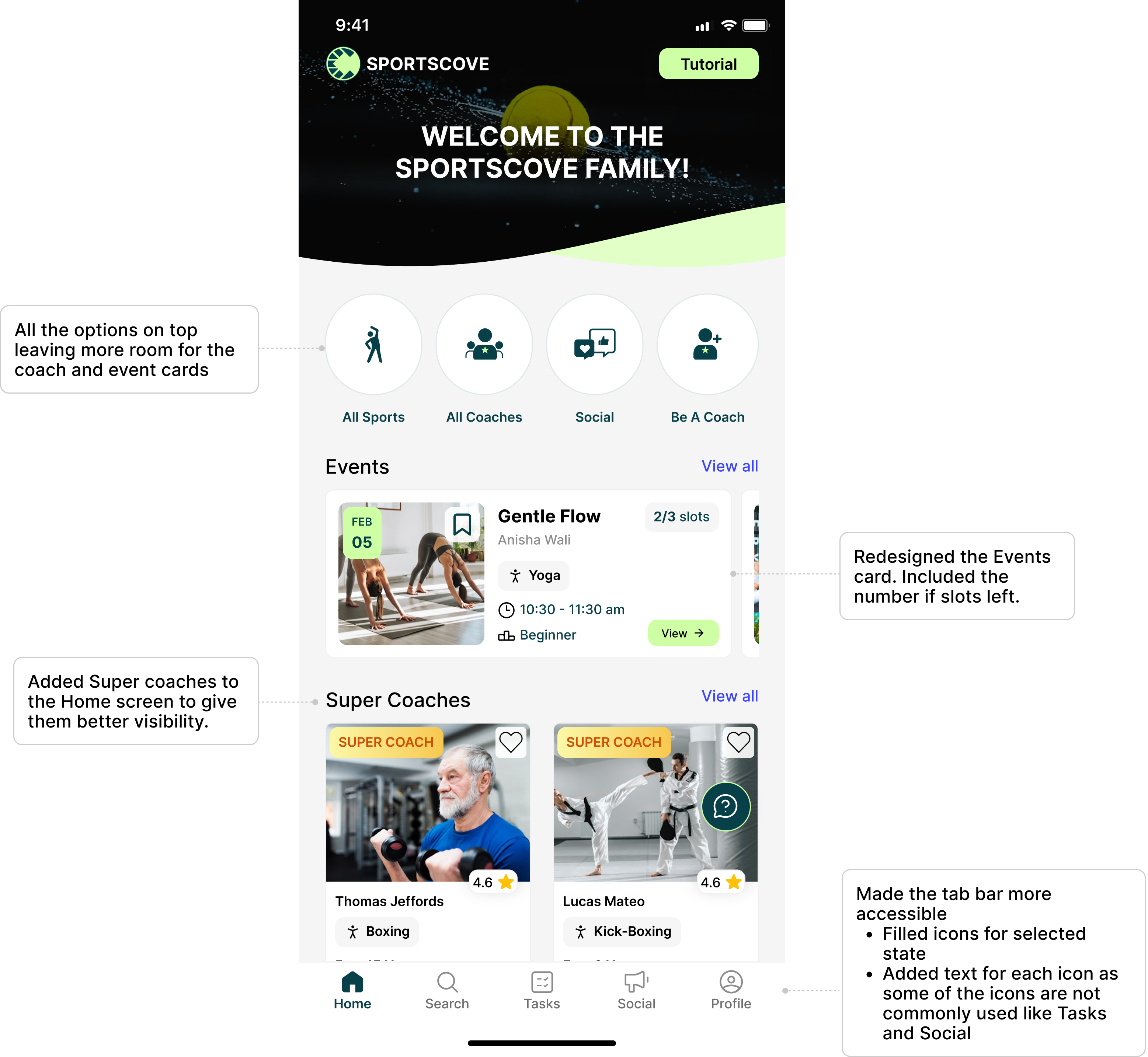
Home screen
From the initial survey, 80% of users were either open to exploring sports beyond their primary one, or wanted to focus on one sport while still seeing what else was out there.
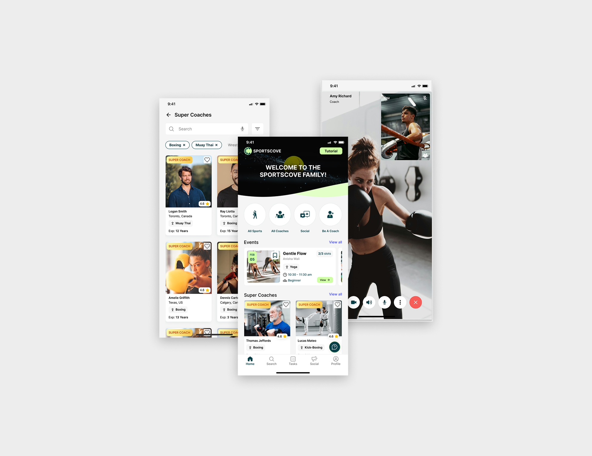
I shaped the Home screen around this, surfacing coach visibility across sports through the Super Coaches and Popular Sport Coaches sections.
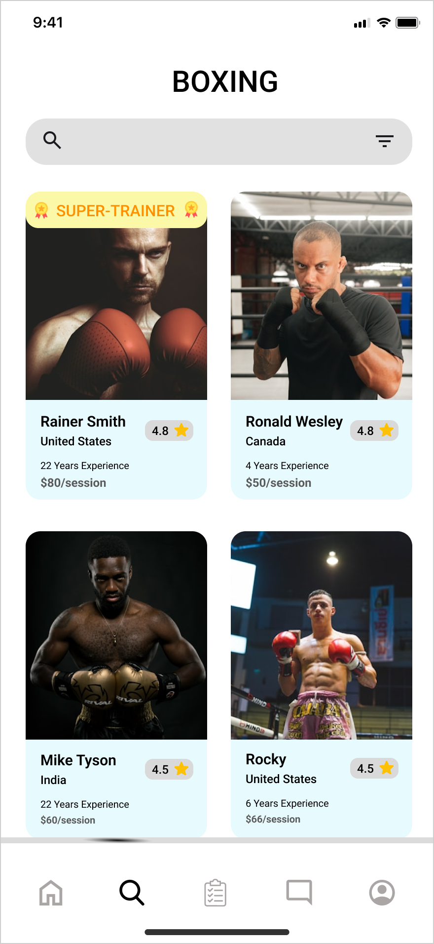
Old
New
Coaches list
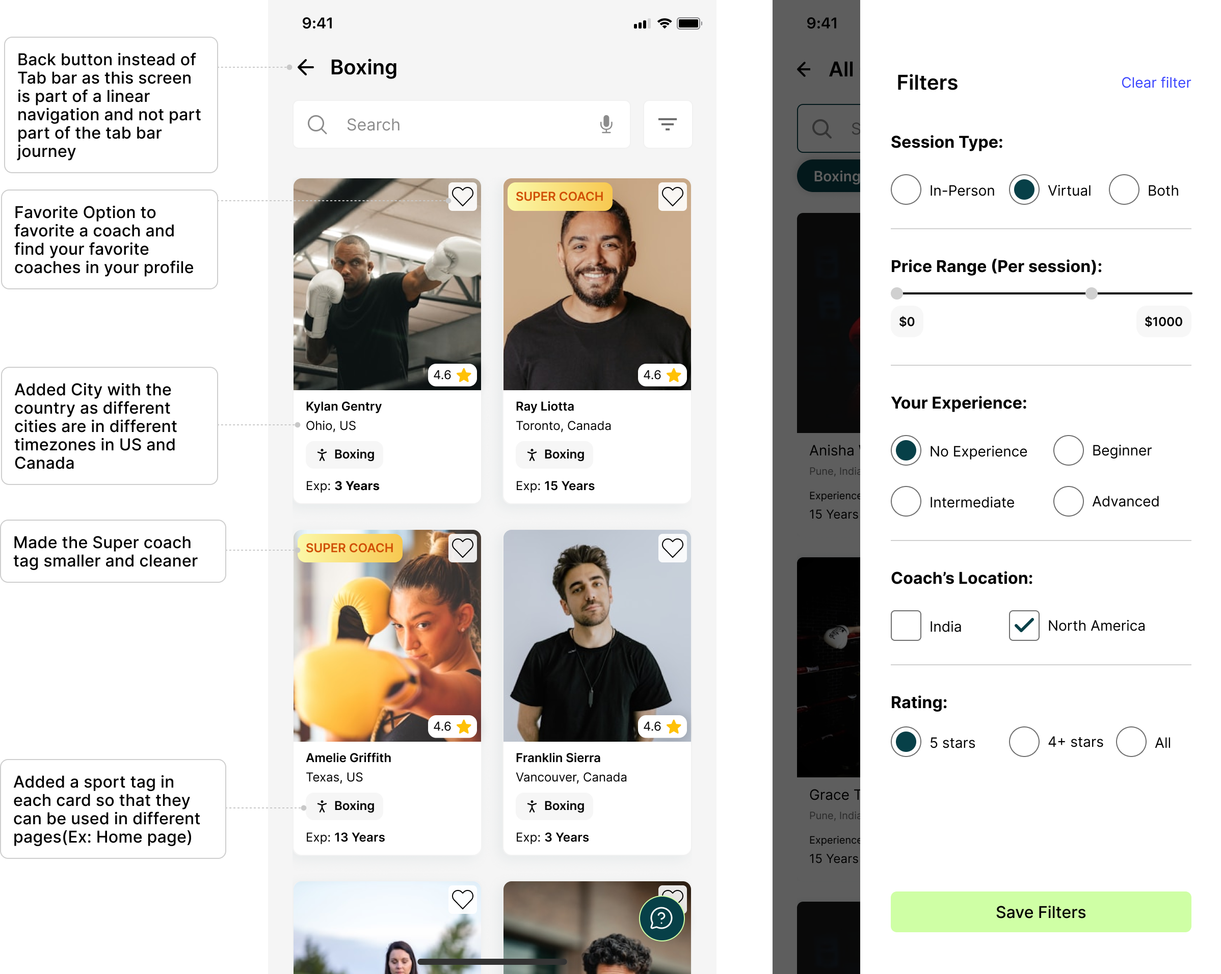
The initial survey showed 100% of users filtered coaches by specific criteria — rating, price, their own experience level, and location — plus a virtual or in-person preference, anticipating the company's plans for physical coaching centres across India.
The old filter existed only as a button with no screen behind it. I built the new coaches list around a fully functional filter based on exactly these criteria.
Old
New
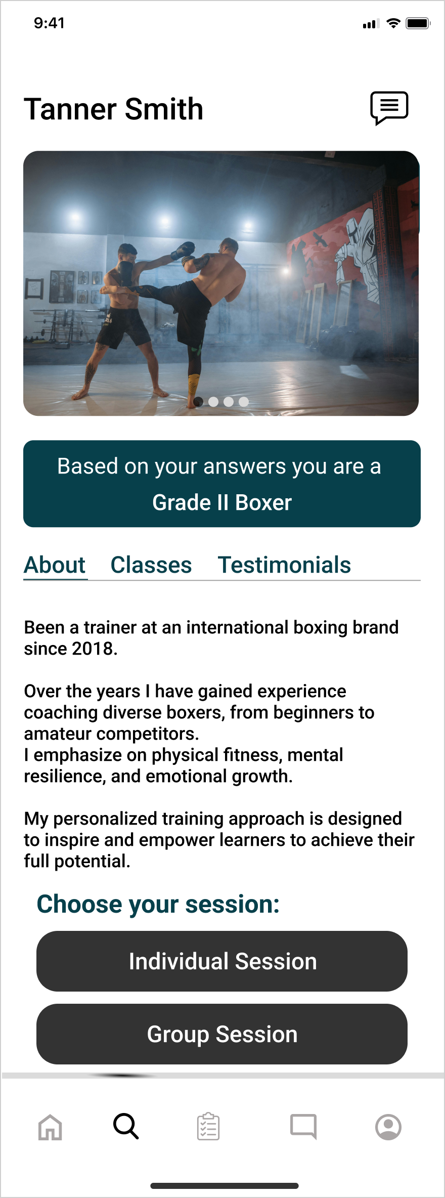
Coach profile
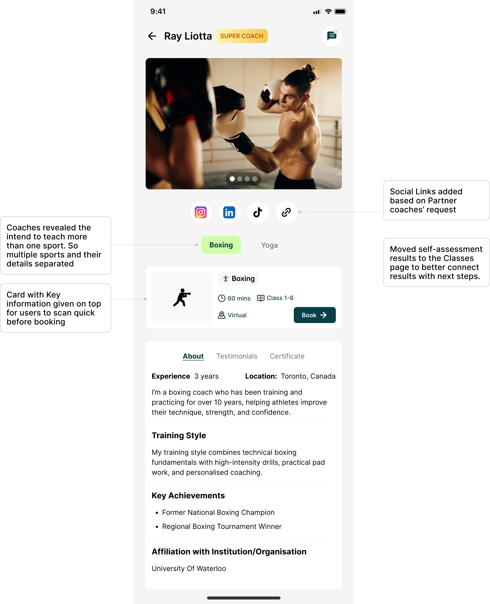
During testing, 80% of users found the coach profile messy and confusing — I rebuilt it to be cleaner and easier to scan.
2 in 5 coaches said they intended to teach more than one sport, so the profile now separates each sport and its details instead of blending them together.
Old
New
06 — Making discovery context-aware
Designing discovery around how Sportscove's users actually search
Sportscove was also expanding into a much wider range of sports and wellness categories, not all of which could reasonably live on the same page.
Your 50-something aunt picking up golf for the first time? Not exactly a power user.
Making search easier for everyone
Guided search
The search prompt dynamically rotates through examples, "Search Boxing," "Search Tennis," "Search Yoga," showing users what they can search for instead of leaving the field blank and open-ended.
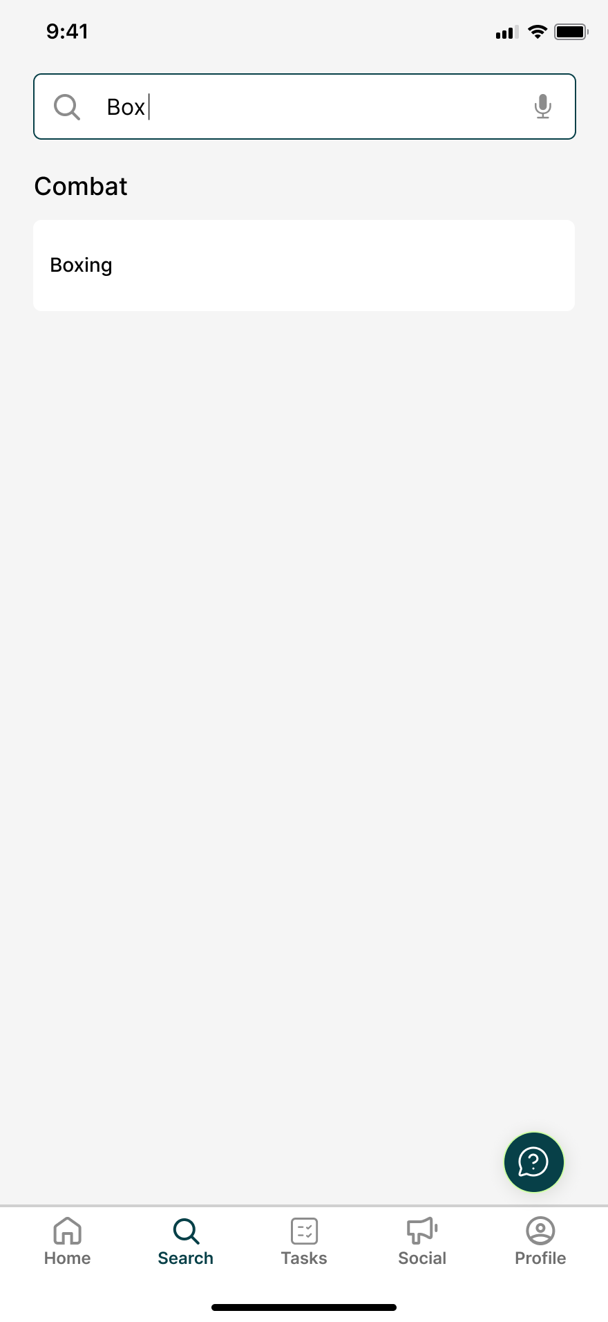
Predictive suggestions
Relevant sports appear as soon as a user starts typing. Typing "Box" surfaces Boxing, grouped under its category, without needing the full word.
Voice search
A microphone option lets users search without typing at all, paired with example phrases and an instructional prompt so the feature is easy to discover, not just available.
Improved filters: I reworked the filters to make narrowing results easier, giving users more control over discovery once a search returned results.
Together, these changes moved search from something you had to already know how to use, to something that showed you how to use it.
Hero design decision
Making multi-sport coaches visible without overwhelming the cards
A coach's profile shouldn't be limited to just one sport
Coaches on Sportscove aren't always specialists in a single sport. Some offer multiple disciplines, which raised a discovery problem: how could those coaches show up across every sport they taught, without turning every search card into a wall of text?
Initial exploration
The first approach I tried displayed every one of a coach's sports directly on the card.
Option 1
Works when both sports have short names, but doesn't hold up once a coach teaches more.
Option 1 (With a longer sport name)
A longer sport name like "Muay Thai" still fits, but only just, leaving no room to add a third.
Option 2
The tag truncated with an ellipsis is readable but looks less polished.
Showing every sport
This made the information explicit, but became visually heavy for coaches with several sports or longer sport names, hurting scannability, especially on mobile.
Truncating with an ellipsis
Kept the card compact, but the truncated tag read as visually unpolished and still didn't communicate how many additional sports a coach taught.
A simpler card, with smarter logic
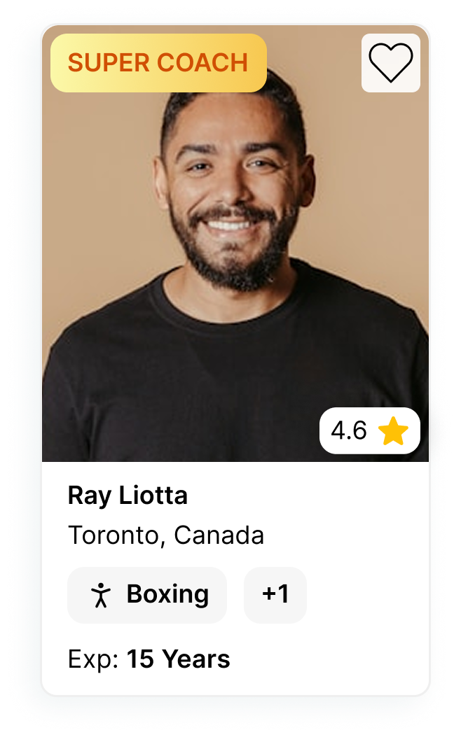
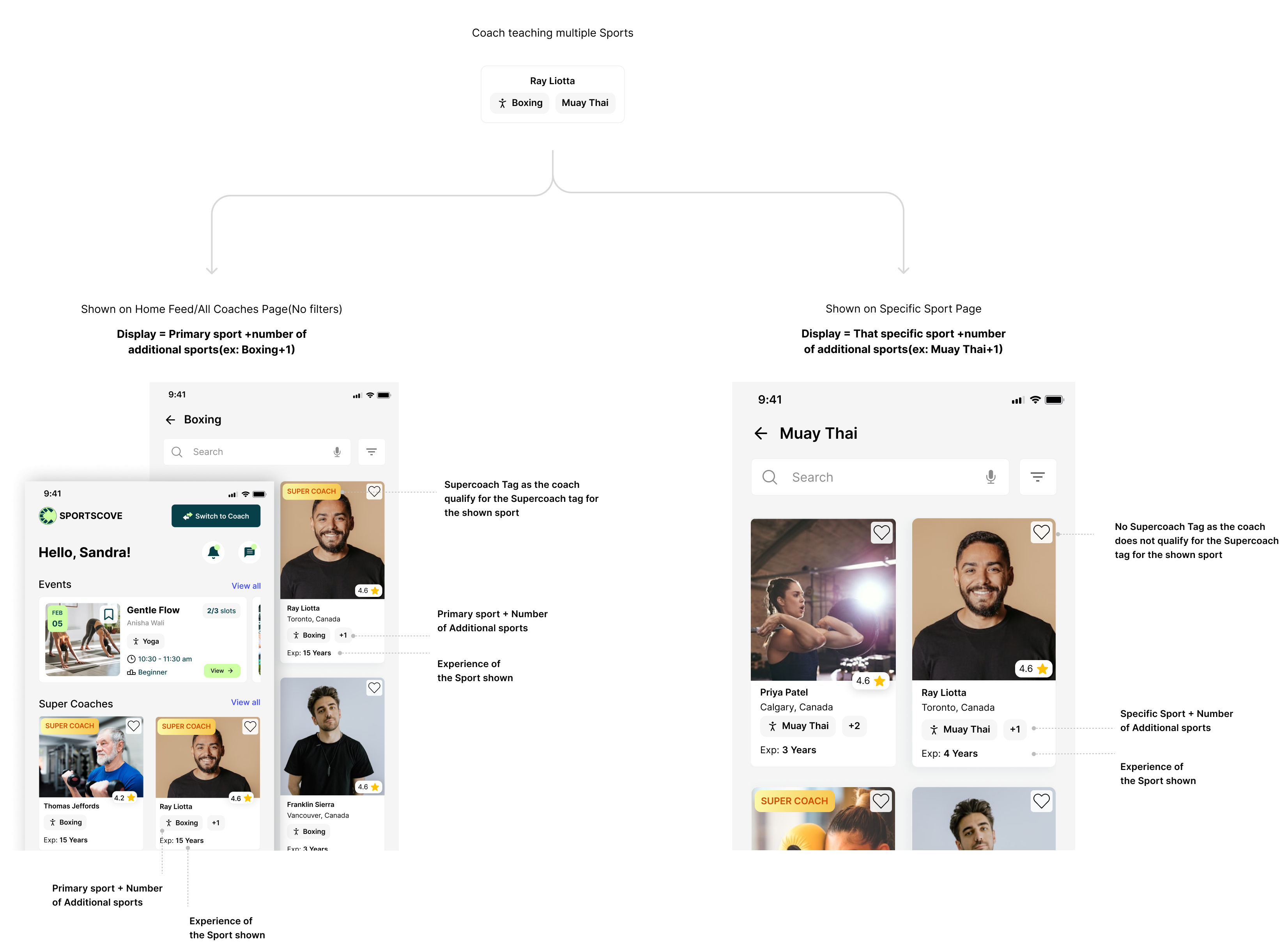
I landed on a +N indicator to keep cards concise while still signalling that a coach offered additional sports beyond the one shown.
But a multi-sport coach can surface under several different searches, so simply showing their primary sport wasn't always relevant. The sport displayed needed to reflect how the user actually found the coach, not just how the coach was set up in the system.
Homepage / no sport selected
Primary sport shown → years of experience for primary sport
Search: Muay Thai
Muay Thai shown first → years of experience for Muay Thai → remaining sports → +N
The card became context-aware: what it showed depended on user intent, not just coach data.
07 — Designing beyond the happy path
Reworking coach onboarding
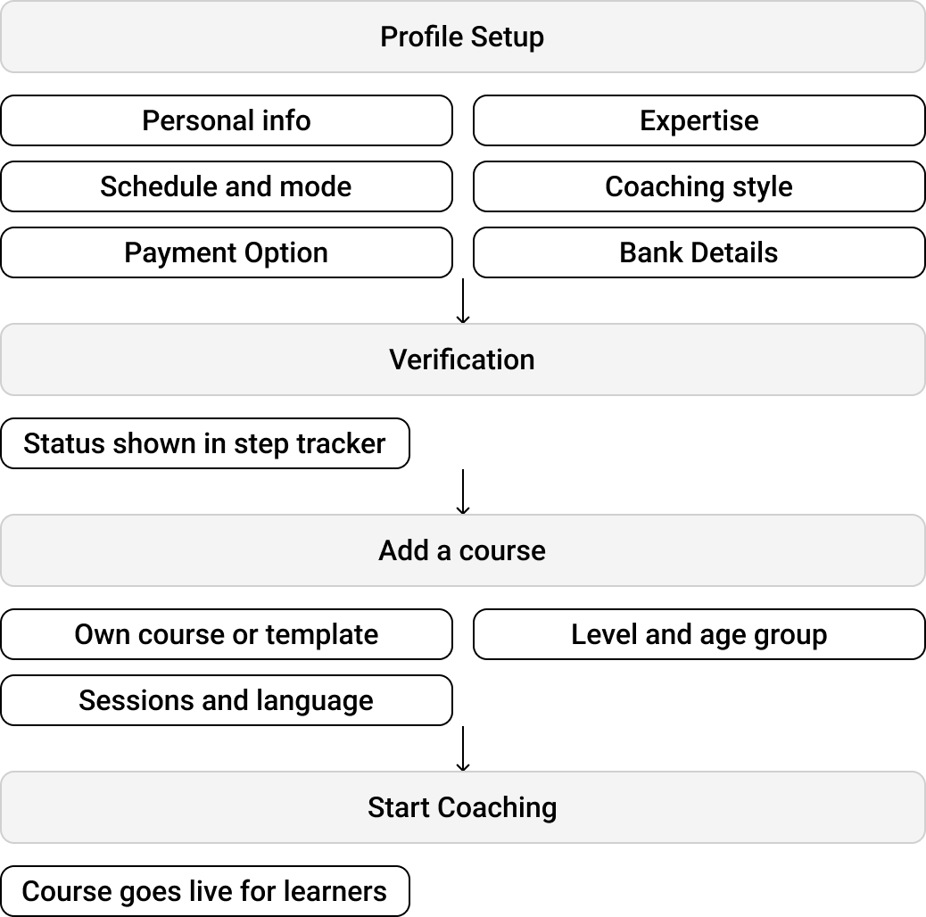
Coach onboarding was where the marketplace's two sides actually met — a coach's profile, verification, offering, and pricing all had to come together into something a learner could trust and book. The existing flow treated onboarding as a single linear form, with no separation between those responsibilities and no way to recover when something went wrong.
01 / Redoing the IA
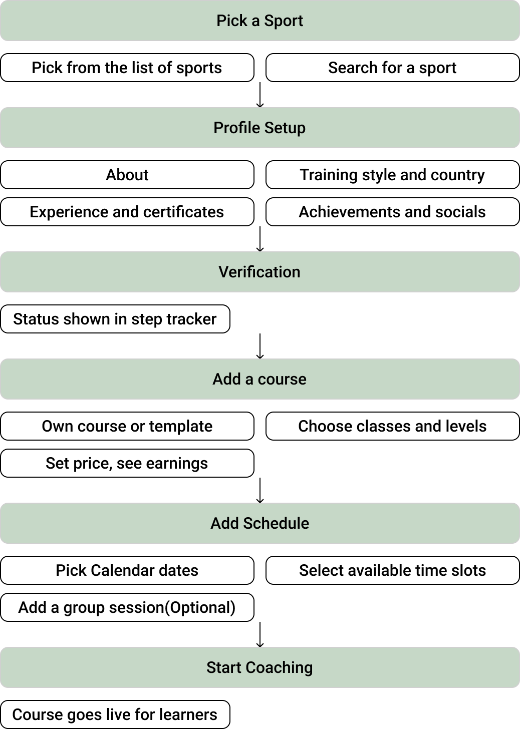
I started by restructuring the existing onboarding into a clearer journey, separating profile, verification, offering and availability.
Old
New
Mixed responsibilities→Clear stages
Profile-focused→Marketplace-focused
Linear setup→Coach readiness
02 / Testing exposed the gaps
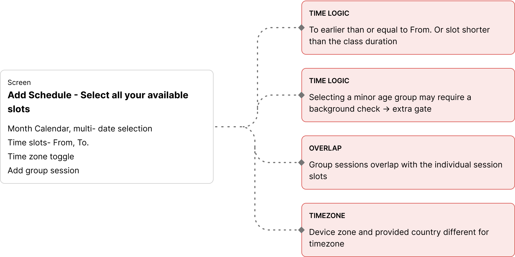
I built a first prototype from this restructured flow and tested it with four coaches. Their responses made one thing clear: the design had only really accounted for the happy path. Outside of it, there was little in place — few error states, almost no prevention, and no way to recover once something went wrong.
Completion state wasn't clear
"I thought I had completed it, so why can't I move forward?"
No way to pause and resume verification
"I don't have my certificate right now. Can I come back to this later?"
Verification requirement surfaced too late
"I filled everything out… and only now I'm being told I need to verify?"
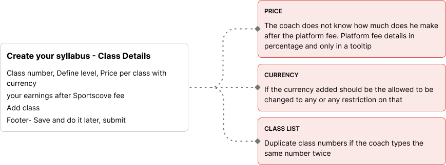
Payout math wasn't transparent during pricing setup
"If the learner pays $100, how much do I actually make?"
No confidence that in-progress work would be saved
"I don't want to finish this right now, but I don't want to lose everything."
03 / Designing beyond the happy path
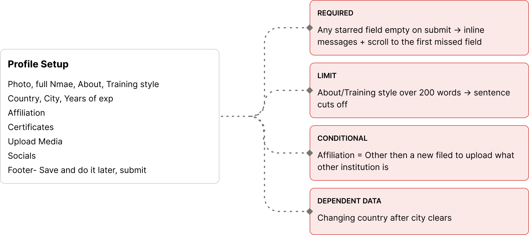
The first flow only mapped the happy path. A closer pass over the form — and testing with real coaches — surfaced the edge cases it hadn't accounted for.
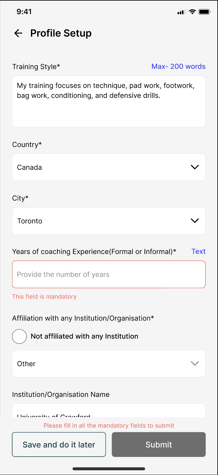
Required fields
Users could reach the end of onboarding without completing required fields, only discovering what was missing at submission.
Change
Required fields now have inline validation, with the flow automatically scrolling to the first incomplete field.
Content limits
The About and Training Style fields had a 200-word limit, but users weren't aware when they reached it.
Change
The fields stop accepting text after 200 words and provide immediate feedback — "200-word limit reached. Additional text not added."
Conditional fields
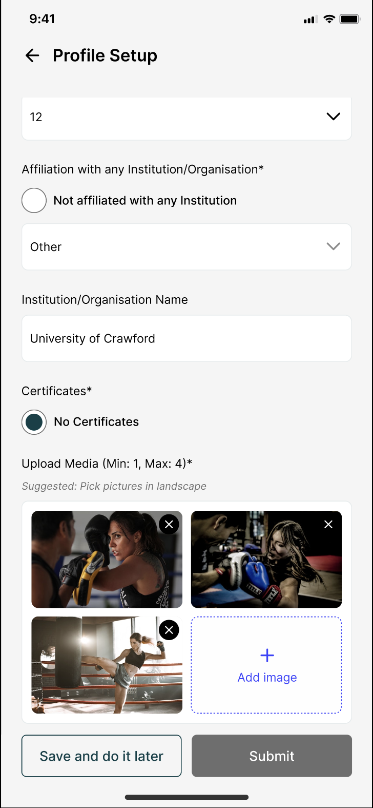
Selecting "Other" as an affiliation required additional information, but the original flow didn't account for it.
Change
The form dynamically reveals a new field when "Other" is selected.
Dependent data
City was dependent on country, but changing the country could leave an outdated city selected.
Change
Changing the country now clears the existing city so the selection always stays valid.
Other screens worked on
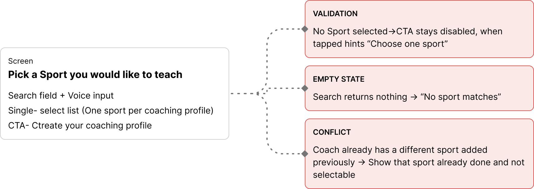
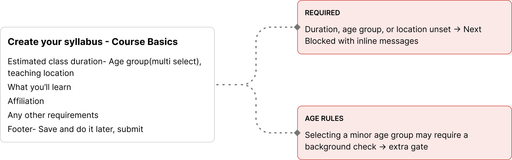
Centerpiece
04 / From a form to a resilient flow
The final onboarding flow consolidates every edge case identified through testing into a single, coherent experience rather than treating each one as an isolated fix. Required fields are validated inline, conditional and dependent fields respond automatically to what a coach enters, content limits are enforced as they type, and progress is saved so a coach can leave and return without losing their work. The result is a flow that guides and recovers at every stage, not only along the happy path.
The best flows aren't the ones without edge cases. They're the ones built to survive them.
08 — Beyond the core work
Beyond the core flows
None of this was on the requirements list. I designed the splash and loading experiences to carry Sportscove's visual language into moments outside the core journeys, because the small, first-impression moments of an app deserve care too — even if it's a small part of the overall project.
Splash screen & spinner loader animations
Designed and animated the app's splash screen sequence entirely inside Figma, using prototyping and smart animate rather than a separate motion tool
Built a custom spinner loader animation the same way, so loading states felt like part of the same product instead of a generic default spinner
Splash screen animation
Spinner loader animation
09 — Outcome
From fragmented screens to a coherent product system
01
A reusable foundation
60+ components created a consistent base for subsequent product work.
02
Shorter path to coaches
The booking flow removed unnecessary gating and introduced multiple entry points.
03
More contextual discovery
Search, filtering, and coach cards adapted to different user intents.
04
More resilient onboarding
Required, conditional, and dependent states were designed for, rather than leaving the experience dependent on the happy path.
The product moved from a collection of partially connected screens to a more coherent system of flows, states, and reusable patterns, ready for development.
10 — Learnings
Key learnings
A marketplace can't be designed one side at a time: a coach's information architecture directly affects what learners can discover, compare, and trust.
Edge cases are product structure, not polish: testing onboarding exposed that the underlying model didn't account for conditional and dependent data.
The right abstraction matters more than the right screen: the multi-sport coach problem wasn't solved by adding more information to the card. It was solved by making the card respond to user context.
What I'd explore next
With more time, I'd have gone deeper on segmenting the research by sport, skill level, and goal before committing to how universal the experience should be across such different sports and wellness categories — the research gap noted earlier in this case study.